David Hockney
|
David Hockney is an English painter, draftsman, printmaker, stage designer, and photographer. As an important contributor to the movement of the 1960s, he is considered one of the most influential British artists of the 20th century.
|

|

|

|

|
In the early 1980’s, Hockney began creating photo collages that he called “joiners”. His earlier collages consisted of grid-like compositions made up of polaroid photographs. He then switched to photo lab processed 35mm photographs and created collages that took on a shape of their own, creating abstract representations of the scenes he had photographed.
|
First Response

|
In this task, I attempted to create a collage of pictures inspired by David Hockney's photo joiners. I took pictures of the same object from varying perspectives, layered them on top of each other and moved them to create a sensical yet abstract image.
WWW: I layered the images on top of each other at the right angles to make the image it's portraying distinguishable yet still abstract. The images are well lined-up, ensuring that the result flows as one image. EBI: There were more pictures from more varied perspectives and if the subject was a more interesting object with more dimension and if all of the images used were of the same clarity. |
Second Response
|
WWW:
The object used was a lot more interesting as it has a more depth this combined with the larger variation in perspectives of the object creates a far more captivating overall image. Furthermore, the background of this photo joiner is a lot more attractive than the last and fits well with the subject; a more simplistic background ensures minimal distraction from the main purpose of the image. EBI: The photos joined to create a full, quadrilateral image. It could also be improved if the pictures were taken in better lighting (possibly even in various different lightings to make it more abstract), and if some of the transitions between images weren't so abruptly different (eg where the leaves get cut off on the left) so that the collage remains sensical while still having abstract elements. |

|
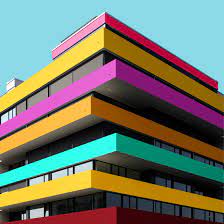
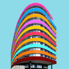
Colour Blocked Buildings
|

|

|
|
Paul Eis is a German photographer born in 1998, however he later moved to Austria to study architecture at university. In 2205, Eis created an Instagram page to showcase his photography, mostly based on modern architecture; "I always had a fascination for towers, bridges and other spectacular buildings. Later, when I discovered photography, I got more into architecture and the built environment around me." However, he soon noticed how bland those monotonous buildings were and began to add colour to the buildings in photoshop to make each of them look unique and have a 'happier' appearance. This movement gained a lot of positive feedback from his community, causing Eis to further explore this style.
Paul Eis
First Response - Paul Eis Inspired

|

(Add gif from school desktop)
WWW: I successfully removed unwanted objects from the foreground, the lines separating each the colours are (generally) precise and the colours blend into the image well. EBI: The colour scheme was more thought out so that they work better together. It also could be improved if the section that was missed in the top left corner was filled. |
Second Response - Simplified Building

WWW:
The lines that separate the sections of the building are sharp and precise. All texture is successfully eliminated. EBI: The whole image was simplified and if some details were kept in (eg the windows). |

|
Form Over Function
André Kertész

|

|

|
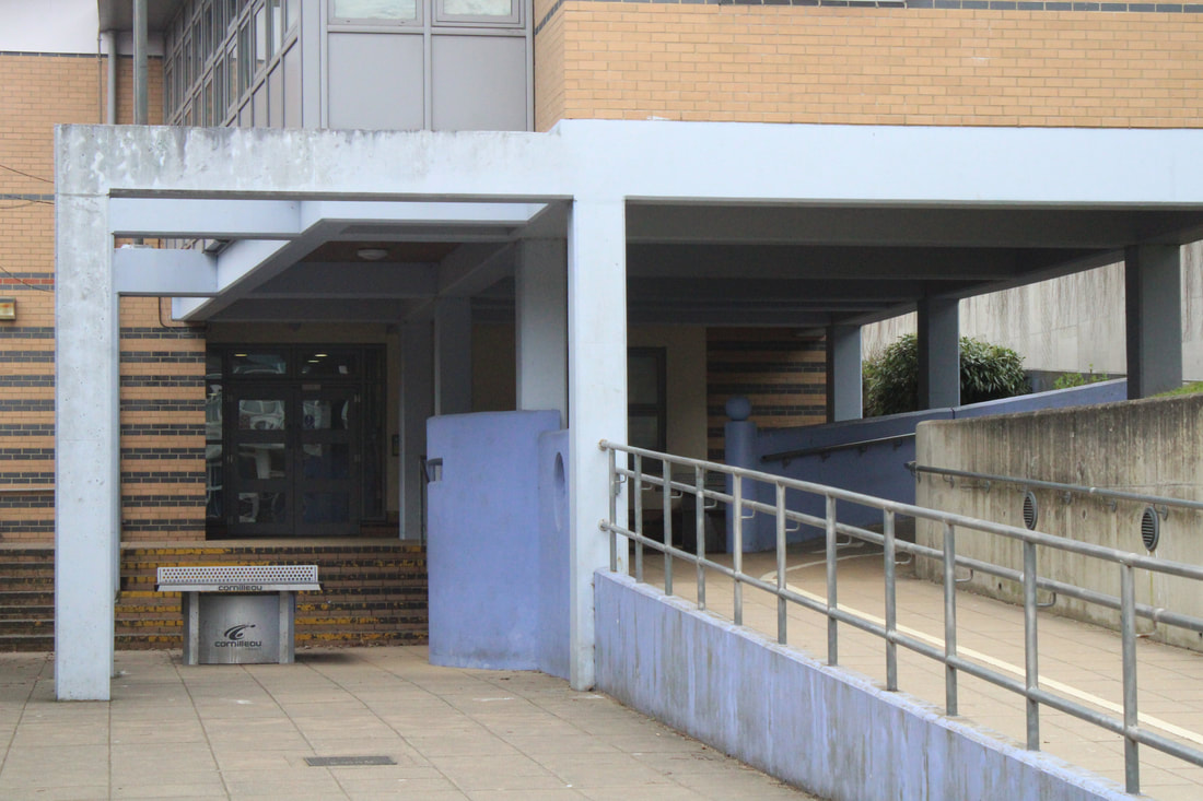
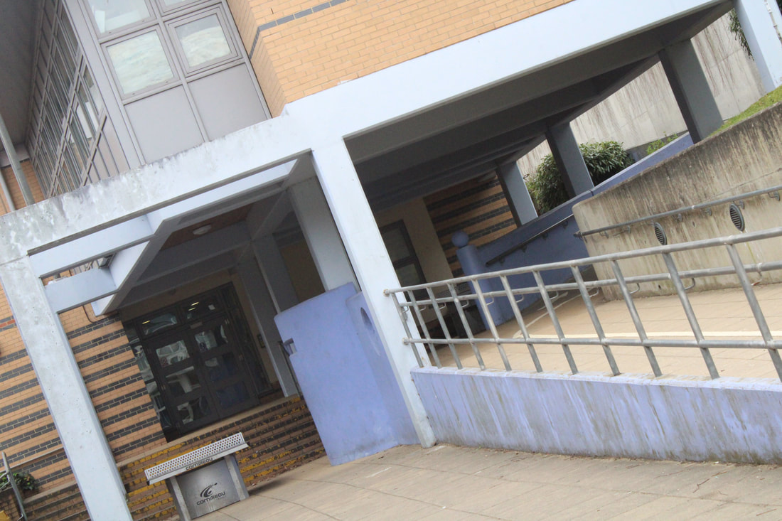
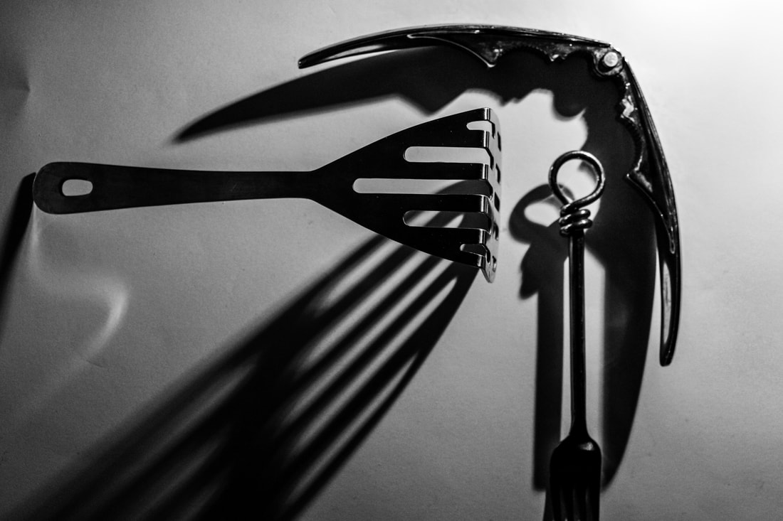
André Kertész is widely regarded as one of Europe’s leading photographic artists, particularly for his contribution to photographic composition and the photo-essay. He is credited with the 'La Fourchette': a perfect opportunity to meditate on strong composition and what makes it so. His work focusses on the idea of taking a mundane, everyday object and photographing it in a way that presents it in a far more intriguing way than usual.
First Response
|
|
WWW:
I managed to take simplistic yet compelling images using only few objects in black and white colour. I edited the pictures taken in a way to create a more dramatic atmosphere. The images are also well focussed and (when multiple forks are in frame) the objects interact in striking ways. EBI: I took pictures from more interesting angles, playing with and distorting the shadows to further intrigue the audience. Furthermore, they'd be improved if I'd focussed more on the background of the images - made sure the white sheet covered all corners, more carefully positioned the shadows etc. |

|

|

|
|
Gif
WWW: The fork remains in a similar place throughout all the frames, allowing for attention to be drawn to the moving shadows behind it. The colours of the lights also contrast well, making the difference in the two shadows a lot more distinguishable. It is also pleasing that both shadows appear to be mimicking each other, reflecting one another on either side of the fork. EBI: The pictures were taken at more regular intervals (the lights move less in between shots) so that the transition is smoother, allowing for a more fluid motion. The gif could also be better if the fork was more in focus so the reflections of the light could be seen more clearly. |

|
Second Response
|
|
WWW:
The light was directed from a variety of angles to manipulate the shadows in new, unique ways. The way that the light isn't just directed from behind the camera allows for more dramatic results as the light often works as a spotlight, drawing our attention towards certain areas of the frame more than others. The photos below are also edited in a way that enhances the drama well. EBI: The white sheet behind the objects evenly covered the entire background so that there are no distractions from the focal point of the image. Some of the images could benefit from a higher aperture. |
|

|

|
Ordinary to Extraordinary
Edward Weston

|

|
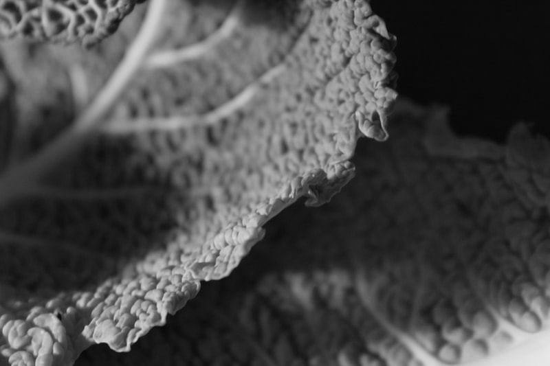
Edward Weston was born in Chicago and moved to California when he was 21. He knew he wanted to be a photographer from an early age, and initially his work was typical of the soft focus pictorialism that was popular at the time. Within a few years, however, he abandoned that style and went on to be one of the foremost champions of highly detailed photographic images.
Some of Edward Weston’s most famous work was close-up images of vegetables and fruit, photographed in a way that captured the “essence” of the object, taking them out of context. His manipulation of light to highlight shape, texture and form helped bring photography out of the shadow of painting and stand on it’s own as a credible art form. |

|

|

|
First Response - Natural Lighting
|
|
WWW:
I took the pictures from interesting angles to create more compelling images, I also used manual focus and a low aperture to draw attention to the primary subject of the photo. Editing some of the images to make them black and white allows the viewer to focus on the textures of the objects, much like Weston's work. The use of natural lighting in the photos means a generally even spread of the light across that side of the object causing simplistic, consistent reflections. EBI: I adjusted the brightness and contrast of the black and white images in photoshop to maintain an intriguing image. They could also be better if more than one type of vegetable/shell were used within the same image to demonstrate a contrast in texture between the objects. Furthermore, the ISO could've been adjusted to fit each individual picture. |

|

|

|

|
|
Second Response - Flashlight
|
WWW:
The artificial lighting creates a very different effect on the object than the natural lighting. The ability to concentrate the light creates more of a contrast between the different areas of the image, composing a more striking overall photo. Also, using a higher shutter speed when working without a tripod - or any steady surface - ensures that the image remains sharp and detailed. Having a high shutter speed can also counteract the harsh lightning, making sure the image isn't too overexposed. EBI: The objects are more in focus and a higher aperture is used in some of the images as a higher depth of field would allow the texture of the entire object to be sharp. If I were to do it again I would also vary the camera angle more for some of the more diverse objects. |
|

|

|

|

|

|
Lockdown Structures
Sharon Radisch

|
Sharon Radisch is known for her unique still life and fashion photography. With her specific use of colors, lighting, and styling, she creates work that is sculptural with elements of tension and connectivity. Sharon Radisch (being a still life photographer) began a series of images during lockdown containing random structures built using everyday household objects. She would use cheap, easily accessible materials - eg fruit, books etc - and stack them together to create essentially useless but attractive sculptures to photograph.
|

|
Response
|
|
WWW:
The sculptures accurately imitated those of Sharon Radisch's. The images are clear and (most) are framed well. The sculptures themselves are also very intriguing to look at, the combination of objects are parculiar, yet somehow work really well. I also experimented the with angles well to get multiple very different images from just one sculpture. The lighting is head on but not too bright so no attention is drawn away from the objects by bright light but they are still clearly visible. EBI: The background covered the entire frame in all of the images. They could also be more pleasing to look at if I'd experimented with objects of brighter, more interesting colours more as they are mostly composed using only objects that are black and brown. Some of the pictures called also benefit from a higher aperture as with these sculptures we would want tall the objects in frame to be focussed. |
Michael Craig-Martin

|

|

|

|
|
Michael Craig-Martin is an Irish artist and painter famous for his incredible impact ion the pop-art movement. He is well-known for his digital art made with simple, still-life photography edited to bright block colours. For this task, I used the photos previously taken inspired by Sharon Radisch's work and edited them in Michael Craig-Martin's pop-art style.
Response Edit

.WWW:
The colours compliment each other well. Having two different block colours for each object makes it clear what each object is and adds an element of depth to the image. EBI: Some of the edges were cleaner and some of the shapes were more precise (less wobbly). |

|
Jan Groover

|

|

|
Jan Groover was an American photographer, well known for her formalist still life photographs of household utensils. She was born in 1943 but it wasn't until around the age of 30 (in the early 70s) that she turned to photography after years of being a painter. All of her photography was incredibly influential, however in this task we focussed on just her Kitchen Still-Lifes.
Homework Response
|
EBI (continued):
very grainy. I'd used water (without soap) in more of the photos. I would also prefer if more bigger objects - things like plates and bowls - were featured. I'd utilised the set up better, framing pictures better and positioned the utensils more interestingly. I added more extra little objects other than the regular utensils. |
WWW:
The colour scheme of the objects all work well together. The colour changes made for the final products below really improve the overall images. The lighting makes the glass look a lot more striking than it would otherwise and the camera is focused well to draw attention to the best part of the image. The use of leaves and petals adds the appropriate pop of colour the photos needed. EBI: They were less zoomed in as zooming in too much when using a phone can make the image |


|
EBI:
The colours of the final result were toned down a little as the yellow can be overpoweringly bright. I should have also focussed more on the actual utensils rather than the background objects. |
WWW:
The selection of cutlery and crockery compliment each other very nicely, they are very haphazard patterns and colours making is pleasingly chaotic. The sprinkle of chia seeds, bottle caps, sliced fruit (and vegetables) and petals really adds to the playful nature of the pictures and works really well with the main subjects. The editing really brings out the colours and - the colours being the most captivating part of the images - make them even more compelling. |


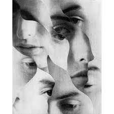
Lauren Marek
|
Lauren Marek is a well-known American photographer who became famous via her social media attention. Her series "Pieces" create's similar work to Chad Pitman who takes pictures of a person focussing on different part os the body, however her work focuses even closer to the person and creates an even more abstract representation of the figure. Inspired by Picasso and his cubism portraits she uses 9 images alongside each other to create her abstract representations of a person.
|

|

|
First Response
(All responses are on school computer)

|

|

|

|

|

|

|
Fireworks in a Jar
Alberto Seveso
|
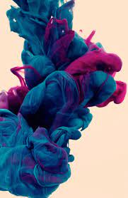
|
Alberto Seveso is an Italian graphic designer and illustrator who created a mesmerising collection of underwater photographs. Seveso created these by mixing a range of colours of ink in water, he used a high shutter speed to capture the incredible swirls and patterns that the ink made when fist poured into the water. His images are focused incredibly well to perfectly illustrate the peculiar texture the ink seems to have underwater. Alberto Seveso is credited with many other astounding pieces - often digital art - but his underwater ink series is definitely one that stounds out due to its creativity and great influence on abstract photography. In this practical we
attempted to take pictures inspired by Alberto Seveso's work. |
Practical
|
For this photoshoot, you only need food colouring, water and oil. In one glass, you pour water until it is about 3/4 of the way full. Then in another, a few tablespoons of oil and four drops of food colouring (all different colours). You then use a fork to break up the small beads of food colouring in the oil into smaller ones before, finally, pouring the oil and food colouring mixture into the water to create an incredible effect.
This works as food colouring dissolves in water but not in oil. Oil is less dense than water, so the oil will float to the top of the glass. As the food colouring droplets sink to the bottom of the oil, they will mix with the water. and the colour diffuses out. |

|
First Response
Edited: Full Shoot:
|
|
|
|
WWW:
The gifs flow well. The editing brought out the colours of the ink nicely. Different quantities of ink being used per drop are demonstrated throughout the different images. EBI: A few of the photos (particularly some of the edited ones) are quite grainy from dramatic lighting edits and being zoomed in. |

|

|
Second Response
|
|

WWW:
The contrast between the bright yellow and deep blue creates a really compelling, this contrast is further emphasised in the edited pictures below. They are in focus meaning the texture can be seen clearly. EBI: The gif wasn't as choppy; pictures were taken at regular intervals and the camera remained in the same place. |

|

|

|
Lockdown Sequences
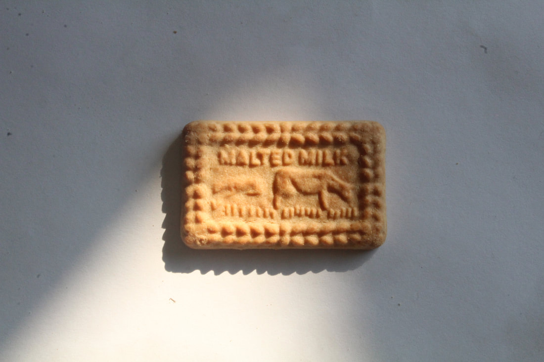
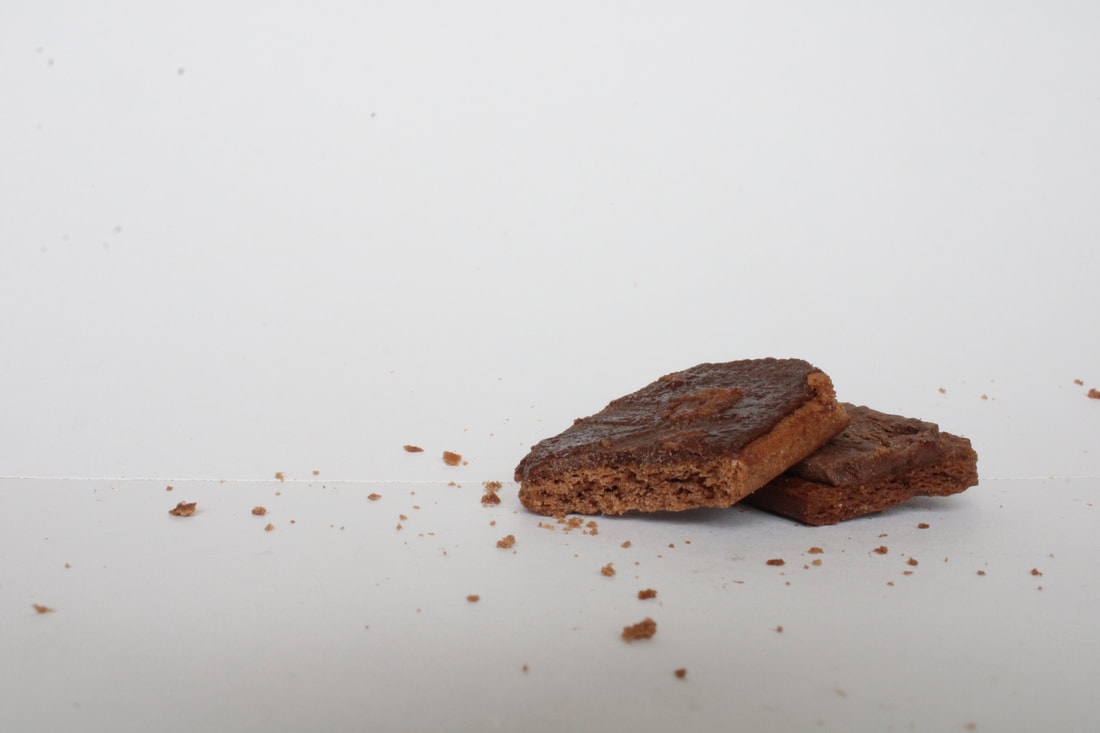
Luke Stephenson
|
Luke Stephenson is a photographer who, during lockdown, decided to photograph every cornflake in a 500g box to show off their individuality. He then used all 7122 pictures and combined them into a 5 minute video. The images have smooth transitions between them as each cornflake is placed directly in the centre of the frame and have a blank background.
|
|
First Response
|
|

WWW:
The biscuit stays in the centre of the frame in all of the pictures which makes the transition smoother. EBI: The background moves around the biscuit so it sort of appears as if it were gliding across the paper which look very odd as a gif. |

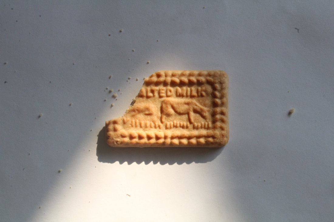


Second Response

WWW:
The biscuits remained in a very similar place in each picture. EBI: The motion was a lot less choppy. |
|


Development One
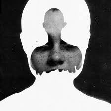
Jesse Draxler

|
|
|

|
Jesse Draxler is an American visual artist, illustrator and art director.
Response

|
WWW:
EBI: |

Development Two
Thomas Kellner
First Response
|
|
WWW:
EBI: The images were more evenly spaced and |
|


Second Response
|
|
WWW:
EBI: |
|