Board
First Response
|
|
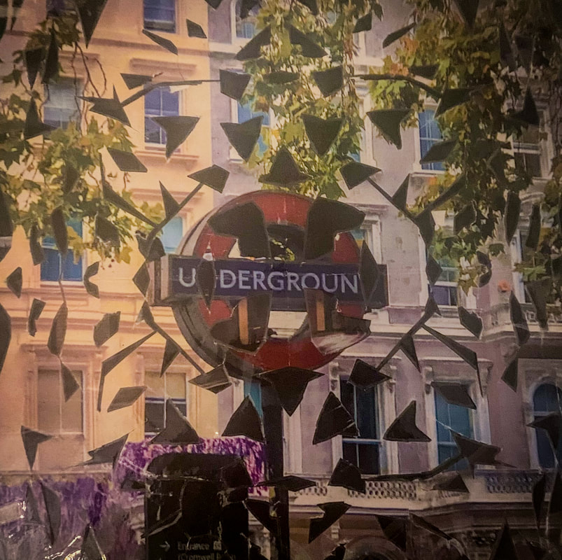
This piece was inspired by one I saw at the V&A in which the artist had folded their colourful photograph and cut patterns into it before layering it on top a newspaper article. I wanted to create my own version of this, keeping the top picture just as vibrant and colourful, but the lower layer instead being gloomier and more mysterious. I achieved this by taking two pictures of the underground, one from above and one from inside. I really like the contrast between the two pictures. |
|
WWW: It relates to the fragments theme nicely. The randomness of the shapes cut out illustrates the deterioration of the warm, comforting exterior to reveal the more sinister, grave interior. EBI: The picture at the back is very dark in comparison and so doesn't add much to the picture; it looks more like a blank background in all places but the centre. The transition between the top and bottom layer was made partially distorted by the lamination. |
|
Second Response

|
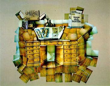
The picture on the left was my inspiration for this response. The diversity of mediums creates a compelling image. I particularly like how the separate fragments in the image are blended together using this variation medium for the transitions. Instead of illustrations, however, I instead wanted to use self-portraits taken from differing angles but in the same black and white style. And instead of writing, I planned on using a complex musical score which would go on to be a perfectly complex base for the piece. |
|
I began by printing out three black and white portraits of myself along with a complex musical score. To create the aged affect I used a teabag to change the colouring. I then ripped up and positioned the portraits before sticking them onto the score. I then used pens in the same colours as the ones in the image above (red, black and light blue) to create random patterns in between the pieces. I then cut the whole thing out and burnt the edges to create the smoky, random outline. |
|

|
WWW: It is an abstract collage that, while sharing many similarities with its inspiration, introduces new ideas that make it unique and more personalised. It's haphazard style and mixed medium emphasise this unique style along with the variation of colour pallet. EBI: I had planned out the process more beforehand, so I had a clearer picture of how I would accomplish each step rather than improvising. This could have made the final piece more balanced and organised. |
Overview
I really like this as an introduction to the fragments project as it allowed me to explore the different ways in which a picture (or pictures) can be fragmented. The creation process was really fun and got me thinking about possibilities for later developments in the project.
Fragments in the Environmment
Photoshoot One - Water
|
|
These pictures were taken across several locations across the UK. WWW: The pictures were taken in a wide range of types of location in order to fully explore the different ways water can affect and fragment in different environments. EBI: I'd have used a DSLR camera as variation in shutter speed would have been an interesting dynamic to introduce. |
Edits
|
I chose to edit pictures that displayed a range of styles so there is no explicit theme to the series. WWW: Some of the pictures (those that were more heavily edited) depict water in a more unrealistic way, as if it were a new substance with new properties which is an interesting contrast to see with those closer to the original. EBI: Some of the photos were framed better. |
|
Photoshoot Two - Architecture
|
|
These pictures were taken in a wide variety of locations with the central focus being the centre of London. WWW: I captured a range of different architectural styles. EBI: Some of the pictures don't have the greatest quality as they were taken on a phone camera. |
Edits
|
Some of these edits didn't necessarily originate with the best of the pictures from the photoshoots as I wanted to play around with how the colouring of an image can really impact the feeling it evokes. WWW: I managed to emphasise the most attractive qualities of the images only using lightroom. EBI: I took pictures in different kinds of environment. For example, I would have liked to photograph architecture in more rural locations. |
|
Overview
Fragments of the Environment demonstrated how pre-existing structures and landscapes can separate a picture into fragments without any actual deconstruction of the picture.
Photo Joiners
David Hockney
|
David Hockney is an English painter, draftsman, printmaker, stage designer, and photographer. As an important contributor to the movement of the 1960s, he is considered one of the most influential British artists of the 20th century.
|

|

|
|

|
In the early 1980’s, Hockney began creating photo collages that he called “joiners”. His earlier collages consisted of grid-like compositions made up of polaroid photographs. He then switched to photo lab processed 35mm photographs and created collages that took on a shape of their own, creating abstract representations of the scenes he had photographed.
|
First Response
|
In this task, I attempted to create a collage of pictures inspired by David Hockney's photo joiners. I took pictures of the same object from varying perspectives, layered them on top of each other and moved them to create a sensical yet abstract image.
WWW: I layered the images on top of each other at the right angles to make the image it's portraying distinguishable yet still abstract. The images are well lined-up, ensuring that the result flows as one image. EBI: There were more pictures from more varied perspectives and if the subject was a more interesting object with more dimension and if all of the images used were of the same clarity. |

|
Second Response
|
WWW:
The object used was a lot more interesting as it has a more depth this combined with the larger variation in perspectives of the object creates a far more captivating overall image. Furthermore, the background of this photo joiner is a lot more attractive than the last and fits well with the subject; a more simplistic background ensures minimal distraction from the main purpose of the image. EBI: The photos joined to create a full, quadrilateral image. It could also be improved if the pictures were taken in better lighting (possibly even in various different lightings to make it more abstract), and if some of the transitions between images weren't so abruptly different (eg where the leaves get cut off on the left) so that the collage remains sensical while still having abstract elements. |
Overview
Although my responses weren't the greatest, I found Hockney's idea of representing a whole scene in one merged picture to be fascinating. This section reminded me greatly of the Thomas Kellner section of the Environment project as presented many perspectives of the same subject in one picture, however I preferred this section as I really enjoy the abstract, haphazard nature of the outcome.
Fireworks in a Jar
Alberto Seveso

|
|
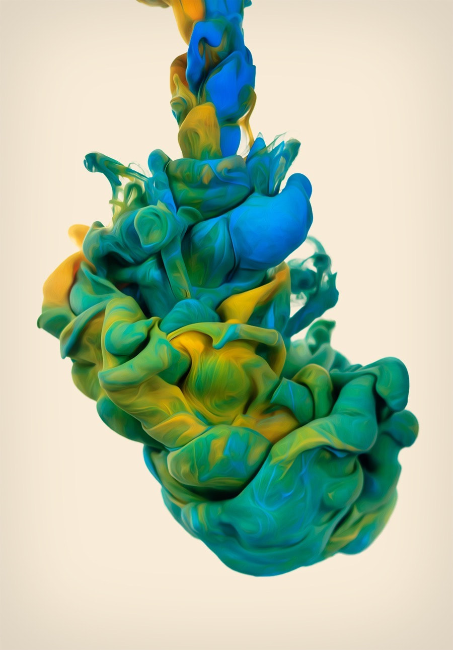
Alberto Seveso is an Italian graphic designer and illustrator who created a mesmerising collection of underwater photographs. Seveso created these by mixing a range of colours of ink in water, he used a high shutter speed to capture the incredible swirls and patterns that the ink made when fist poured into the water. His images are focused incredibly well to perfectly illustrate the peculiar texture the ink seems to have underwater. Alberto Seveso is credited with many other astounding pieces - often digital art - but his underwater ink series is definitely one that stounds out due to its creativity and great influence on abstract photography. In this practical we
attempted to take pictures inspired by Alberto Seveso's work. |
Practical
|
For this photoshoot, you only need food colouring, water and oil. In one glass, you pour water until it is about 3/4 of the way full. Then in another, a few tablespoons of oil and four drops of food colouring (all different colours). You then use a fork to break up the small beads of food colouring in the oil into smaller ones before, finally, pouring the oil and food colouring mixture into the water to create an incredible effect.
This works as food colouring dissolves in water but not in oil. Oil is less dense than water, so the oil will float to the top of the glass. As the food colouring droplets sink to the bottom of the oil, they will mix with the water. and the colour diffuses out. |
|
Photoshoot One
|
|
WWW:
I made use of two contrasting colours to really bring out one another in the photos. The lighting and plain, white set-up also really helped in making the colours pop and therefore nicely displaying the abstract shapes this formed. The fast shutter speed also enabled these shapes to be caught in detail. EBI: Some of the pictures weren't focussed on the inside of the cup (sometimes on the outside or background instead) so the detail of the shapes was sometimes lost. Also, peoples arms and hand are featured in the back of the shots, ruining the otherwise clean feel. |
Edits
|
WWW: The variations to colour further brought out the already striking colour contrast. Sharpening the pictures and altering their texture really emphasised the finer details to the shapes. EBI: I'd found a way to entirely erase the excess aspects (anything that wasn't the ink) and have a block-colour background in order to create a response that reflected the work of Alberto Seveso better. |
|
Gif

|
WWW: I like how the movement of the camera appears as though flowing with the ink. EBI: The gif was more fluid as the lack of frames and fast pace makes it appear choppy. |
Photoshoot Two
|
WWW:
This shoot caught a wider variety of shapes and colour of the ink than the last one as I explored more possibilities of how the ink placement and volume could be manipulated to range the results. Again, the fast shutter speed allowed me to capture the moving shaped as if they were static. EBI: The suboptimal lighting and fast shutter speed forced me to greatly increase the ISO to a point where lots of the images seem grainy. In a lot of cases, this excess noise distracts from the shape itself. |
|
Edits
|
|
WWW: I leant into the characteristics of each picture that differs them from the others to create variation of the final edits and cover all bases before moving on from the section. EBI: I'd cropped out all unnecessary negative space so the picture will be more balanced and focussed. I would also have liked to have been able to reduce the grain of some of the images. |
Gifs

|
WWW:
Using less frames in the reverse of the movement created a really cool bouncing effect with the finished result. I am also glad that I chose to keep the camera practically stationary between shoots as it allowed attention to be solely brought to the movement. EBI: Lighting remained constant in between shots to reduce the flashing effect created in the gif to the right. |

|
Overview
This section was like nothing I'd ever looked at before throughout the course. It altered my view of what is meant by 'fragmentation' and made me think more about how I can develop my ideas outside the focus on ordinary landscape photography.
Lockdown Sequences
Luke Stephenson
|
Luke Stephenson is a photographer who, during lockdown, decided to photograph every cornflake in a 500g box to show off their individuality. He then used all 7122 pictures and combined them into a 5 minute video. The images have smooth transitions between them as each cornflake is placed directly in the centre of the frame and have a blank background. |
|
Photoshoot One
|
|
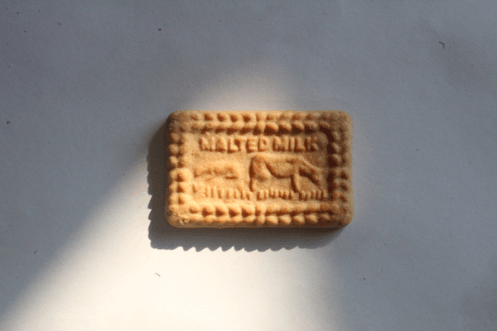
WWW:
The biscuit stays in the centre of the frame in all of the pictures which makes the transition smoother. EBI: The background moves around the biscuit so it sort of appears as if it were gliding across the paper which look very odd as a gif. |


Photoshoot Two
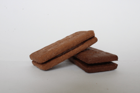
WWW:
The biscuits remained in a very similar place in each picture. EBI: The motion was a lot less choppy. |
|


Overview
Although looking at sequence and the development of an object over time interests me greatly, what I preferred about this section was looking at why Stephenson committed to this lockdown project, a notion that got lost in my response. While his focussed of the beauty of simplicity, mine was centred around movement and change over time.
Silhouette
Jesse Draxler

|
|
|

|
Jesse Draxler is an American visual artist, illustrator and art director who uses fragments of multiple angles of a persons face to present them as construction of these many angles of them self. Draxler uses a combination of eery pictures and colourless images to create this gloomy, sinister effect to his pieces.
Photoshoot
|
|
WWW: I photographed a wide variety of expressions and angles of the of the model to give me freedom of choice when combining the images together. I used a good, constant lighting to ensure the pictures went well together. EBI: The height of the camera had been altered to create a new dimension to the pictures. |
Process
|
I began by taking one of the side profile pictures and cutting out the outline of where the subject's skin was exposed to create an authentic base.
Next, I layered my favourites of the shoot on top of each other in photoshop and, much like Draxler, cut out curved lines to give an interesting transition between the portraits. After the entirety of the silhouette was filled out in this style, I eliminated the background to just a blank, black base and changed the colouring to monochrome. Finally, I used the burn tool to shade along where the shadows originally were on the silhouette so it still held resemblance to the original photograph. |

|
Edit

|
WWW: The final picture reflects a heavy resemblance of Jesse Draxler's work, however I made it very much my own by maintaining the outline of the face and keeping the images as appearing 2D, allowing me to layer them how I liked. I also believe the shading to the underside created a nice, 3D effect. EBI: I'd thought I'd wanted the placement of the figure to stay the same, however now I think it could benefit from a more central position in frame. The picture is also a little darker than I'd have liked, making the highlights stand out too much; it could be improved with a lower contrast. |
Overview
This was, shockingly, the first section I've done on portraits and has made me want to develop on this idea. I believe there is lots of opportunity to be found in portrait photography and it is a theme I would like to develop on throughout the project.
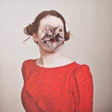
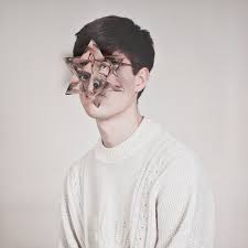
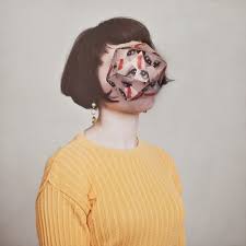
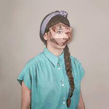
Geometric Portraits
Gordon Magnin

|

|
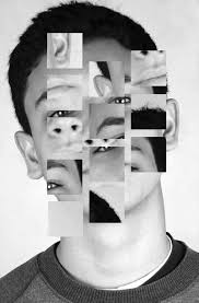
Gordon Magnin is an LA based artist who uses fashion images and turns them into a unique collage of "altered found images" with his use of geometric patterns. His background consists of a Masters degree from the Southern California Institute of Architecture, a bachelors of science in structural engineering from the University of Nevada, meaning that his skill is entirely self taught and his experience is fewer than other artist who have manipulated images for a longer length of time to get to this level of skill.
|
|
He describes his work as "precise, intricate, geometric and destruction". His alteration of single images using precise geometric cuts and operations completely re structure the form of the original photos, and due to the majority of his photographs being portraits, the repositioning of geometric shapes cause deceptions at first sight as the eye is not used to features of the face being in strange places, which is what makes his work so unique and individual. His use of black and white colouring accentuates the features of the face even further due to the quality and use of shadow in his photographs. |

|
|
Photoshoot
|
|
WWW: The portraits themselves are similar in style to that of Magnin's work; they are black and white with a central focus on on the face. The pictures are also well-focussed and framed. I used a variety of models which will make the edited pictures more diverse. EBI: All pictures were taken portrait. It could also be improved with better, more direct lighting as opposed to the great contrast in brightness across the models faces in a handful of the pictures. |
Edits
|
WWW: The direct inspiration from Magnin is clear and his style is consistent throughout the series despite my pictures being more modernised. EBI: Some of the final pictures appear slightly blurred. Some of the pictures also aren't evenly balanced in complexity - in other words, the order in which the piece was edited is visible. |
|
Comparison
Original Images Edits Inspiration

|

|

|

|

|

|

|
|

|

|

|

|
Overview
This section was similar to the Jesse Draxler section as it focussed on using a digital medium to edited a black and white portrait. I liked the two responses in the middle the best as they demonstrate how changing one simple element of an image had such a big impact on the resulting piece.
Cosmic Surgery
Almar Haser
|
|
Cosmic surgery is imagined as a medical procedure that people can choose in the not so distant future for aesthetic enhancement, mood alteration, and to thwart increasingly pervasive methods of surveillance. Combining photography with collage and origami, Haser's playfully odd portraits consider the link between identity and image in a culture of visual bombardment. |
|
She suggests a fundamental shift in the way we understand ourselves and the world around us, picturing the possibility of a trans-humanist future. "Experimentation has shaped my identity as an artist. I’m always thinking about different sculptural approaches to photography and how I can build layers into the work. I never know exactly how I’m going to produce the work until I’ve spent hours experimenting. Most of the time it’s a happy accident that shapes the final piece." |
|
|
Process
|
|
I began by taking pictures of and printing out a front profile portrait, along with a template of a hexagonal prism. I then stuck these pictures onto the front and back side of a piece of card in such a way that the models features lined up with the net of the shape. The card provided additional stability to the later shape. I then cut out the shape before folding and gluing the tabs together to create the final structure. I then added clear tape to give the structure extra support. All that was left to do was place the shape on top of another printed portrait and experiment with placement. |
Response
|
WWW:
The angles of the camera and placement of the shape created really cool effect with distorted dimensions. The pictures are well focussed with a high aperture so both the deeper and shallower areas can be fuller observed. EBI: There was no tape visible in the images as the reflections can be distracting. I also would have preferred the results if I'd have used a shape with similar faces - eg a dodecahedron - over the hexagonal prism as it would've allowed me to focus on different features separately. |
|
Overview
It was interesting to physically edit the portraits rather than digitally as it was interesting to see the effect depth could have to the image, this is something I'd like to further develop later in the project.
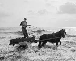
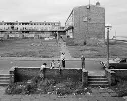
Gallery Visit
Chris Killip

|
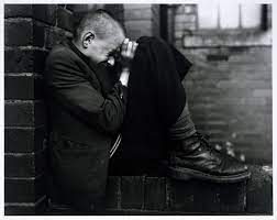
|
Christopher David Killip (11 July 1946 – 13 October 2020) was a Manx photographer who worked at Harvard University from 1991 to 2017, as a Professor of Visual and Environmental Studies. Killip is known for his black and white images of people and places especially of Tyneside during the 1980s.
|
|
It was these black and white images displayed at the gallery that we were given the opportunity to study. I found that the lack of colour allowed focus to be drawn solely to the shapes and expressions of the subjects in the images. This attention to detail, when paired with the context given, allowed the pictures to be seen as part of a larger story and could be appreciated on a level beyond the superficial.
|
|
|
Overview
Getting to go to a gallery again was an incredible experience, not just to properly see Killip's work as intended and in context, but also to be in such a creative and curious atmosphere. I found Killip's brutalist style to be extremely captivating and can portray very powerful messages. It is work like this that I believe represents the power of photography at it's finest.
Break the Structure
Patrick Cornillet

|

|
Kellner's’ work imitates the wandering look of the eye, showing us segments of the total which come together as one image. Therefore his photographs do not necessarily deconstruct architecture but instead reconstruct our view of it. His work offers an alternative view of famous landmarks, one that intends to question our thoughts on how we visually process them and develop a sense of place.
|
|
Kellner uses the traditional process of film photography to create montages. Using just one roll of film, Kellner often takes images of the same landmarks or buildings of significance from different angles to later re-arrange them on a contact sheet and create a unique composition. |

|

|
Photoshoot
|
|
The location of this shoot was at The Barbican in central London as, not only were the surrounding landscapes unique, but the building itself was composed of many different unusual shapes. WWW: I captured lots of different area of the building in which the shapes interact in interesting ways. EBI: I'd zoomed in on more particular sections rather than an entire area or landscape. |
Edits
|
The picture to the right is the one I chose to deconstruct as it consists of several noteworthy sections of which I believe should be dissected to appreciate in greater detail. I decided to split it into three sections: the tall tower to the right, the logo on the left and finally the prismatic glass shape located centre frame. I chose these fragments as they greatly contrast from one another and are a prime example of the diversity of London's architecture. |

|
|
|
WWW: I successfully demonstrated how the beauty by focussing on one simple section of an overall complex image can change how a person perceives an image. I chose appropriate shapes within the building to fragment. EBI: I'd applied this same concept across multiple different landscapes. |
|
I decided to take one of the three fragments and isolate it on a new backdrop (and only change the colouring ever so slightly) as an experiment to see how a change in environment would affect the perspective of the viewer. Although the scene has now been made to be blatantly artificial, it still evokes a different - more serene - reaction in the viewer which contrasts greatly to the cynical atmosphere it created when isolated against a clinical white background. |
|
Overview
Although I found this task to be enjoyable, it made me realise that - when it comes to the fragments project - I much prefer working with people and faces as more character can be displayed from only a portion of a person. However, it was interesting to see the effect of isolating random sections of a building and how it is context that really makes an image.
Facial Merging
Ino Zeljak

|

|
Ino Zeljak was born in Zagreb in 1987. While finishing his BA degree in Biology and Environmental sciences at the Faculty of Science he enrolled in the undergraduate course at the Department of cinematography of the Academy of Dramatic Art in Zagreb. After getting his Bachelor's degree in cinematography before enrolling in the graduate course of photography where he finished his senior year. In 2014, Zeljak created a series of pictures in which he would merge the faces of two people that looked very similar (in photoshop) to accentuate their differences and create these unsettling portraits as shown. |
|
I wanted to take Zeljak's idea of facial merging but, instead of using two similar people to create an asymmetrical portrait, I took portraits of a range of people with the plan to take a feature of each person and us Zeljak's merging technique to create a new face. |

|

|
Photoshoot
|
|
WWW: I took all of the pictures with consistent lighting which will later make the transitions between the pictures smoother. I also managed to capture a variety of people which will create a more interesting contrast. EBI: All of the photos were taken portrait to capture more detail and maintain consistent sizing across the images. |
Response
|
WWW: The 'new person' has realistic proportions. I had originally wanted to keep the skin looking human, though I am glad I decided to plasticise the texture of the skin as it adds to the idea of the face being constructed and evokes an eery feel about the image as it leaves something feeling not quite right. EBI: I had included at least one facial feature from each person I had photographed to show greater diversity and unity. |

|
Overview
I liked getting back to portrait photography and I thought the concept behind this piece was really unique. This also greatly improved my skills on photoshop.
Development 1 - Fragmentation by Liquid
Week One
Photoshoot
|
|
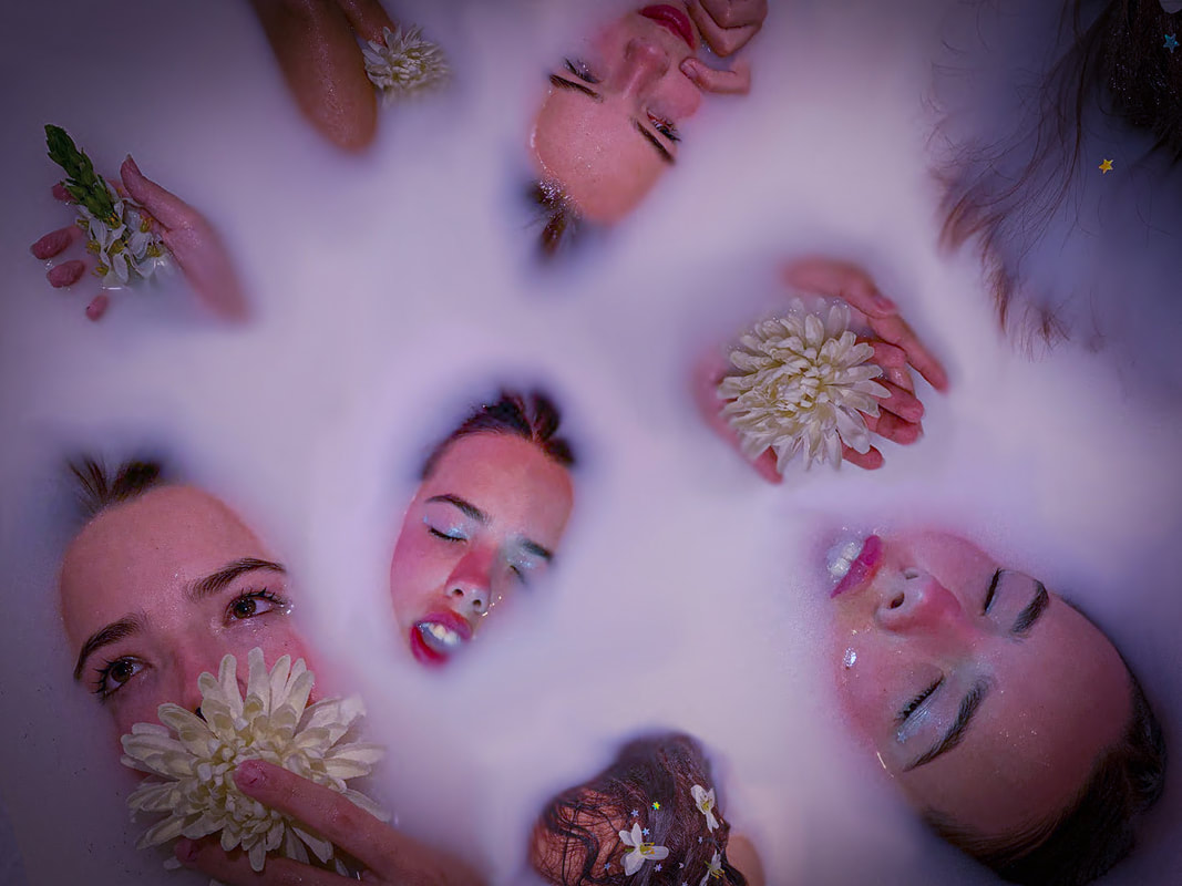
For this shoot, I filled up a bathtub with water and poured in 4 litres of milk to give this opaque white effect. I used this as well as glitter and some props - mostly flowers - to create a dreamy, almost utopian effect. The aim was to capture images of different parts of the body but have the surroundings obstructed by the liquid to allow focus to be brought solely to that one fragment. |
Edits
|
WWW: The purple tint and haze furthers the dreamy effect. The central framing of the focal point of the image and the accompanying vignette allow for the subject to be framed and emphasised. EBI: I had captured a wider variety of body parts and included a larger range of photo styles to create a greater contrast from picture to picture. |
|
Week Two
Editing Method
|
|
I started by layering the images that I wanted to use in photoshop above a blank background just to see how I would like them to be laid out. I then took one of the images from the shoot and zoomed it on only the colour of the milk and set that behind all of the other layers, so I had a base to work off of.
Next, I merged all the layers into one which would allow me to blend to colours together using primarily the clone stamp tool and smudge tool to create smoother transitions between the images. Finally, I loaded the image into lightroom where I attached my custom preset I had made for the earlier edits to remain consistent with the theme. |
Final Piece
|
WWW: The spontaneity of the piece made it quite original and creative. The dreamy, mysterious theme also prevails in the image. The combination of multiple different photos also displays a variety of fragments of the body in an abstract layout. EBI: I'd blended the milky background together better for the appearance of more seamless transitions between what were previously separate pictures. It would also have been a nice touch to add glitter and other small props in the gaps between the body parts as they are recurring motifs. |
|
Development 2 - Fragmentation by Light
Week Three
Photoshoot
|
|
The aim of this shoot was to capture portions of the subject's face in bright light and allowing the rest to be obstructed by darkness. To achieve this, I used a pitch-black room and had a concentrated flashlight as the only light source to zoom in on details of the face. The flashlight's orange-tinted edges acted as a border between the focus and the darkened portion of the face. This clear distinction helps in accentuating the lit-up area by acting as a natural frame. |
Edits
|
WWW: The large contrast between the light and dark not only enhances the theme of fragments, but also creates a mysterious, gloomy atmosphere. EBI: I'd centred some of the pictures around different areas of the body besides the face. |
|
Week Four
Weaving Method
|
|
I printed two of my pictures: one upside-down and the other the right way up. After trimming the photos, I stuck them onto sheets of black cards so, once cut, the paper wouldn't be flimsy to work with or too easy to rip etc. On the base image, I cut horizontal, one-centimetre-thick strips across but made sure to leave a vertical, one centimetre strip up the left-hand side. On the other image, I cut vertical strips of equal length up the entire image (making sure to label the strips so as not to get confused). Then I began weaving the vertical strips, alternating above and below the horizontal ones. After my first attempt, I wasn't satisfied by the placement of the overlap between the images, so I removed a few of the strips and repositioned until I was happy.
|
Final Piece
|
WWW: The great contrast of light being prevalent in both of the two pictures allows the point at which the subjects in the two images connect to emphasised. EBI: They had been printed better so that the ink wouldn't wear away at the edges of some of the darker strips, letting the transition appear more clean. |

|
Development 3 - Fragmentation by Nature
Week 5
Photoshoot
|
|
The idea for this was shoot was to investigate how trees can be used as natural obstructions to separate an image. I'd previously used a purple and an orange theme for the final pieces so using nature meant that a green palette would not only perfectly suit the shoot, but also finish off the set of the three secondary colours, ensuring the final pieces would show variation and contrast. |
Edits
|
WWW: I explored the different ways of which natures can obstruct parts of an image to allow attention to be drawn to only fragments of the subject. EBI: I'd have used a DSLR camera rather than a phone camera as the inability to vary setting led to some pictures appearing blurry. I should also have used a controlled source of light (e.g. a flashlight). |
|
Week 6
Process
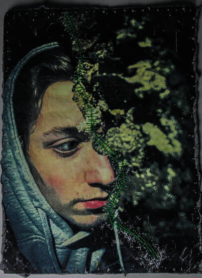
For this first piece, I began with a picture that was separated into two clear sections: the tree on the left and the body on the right. I printed the picture and used green pens that reflected the colours of nature to draw a divide between the tree and the figure that looked almost like a cartoon of a vine. I then followed up by using a black pen to draw eery silhouettes of tree branches to border the image.
For the second picture, I began with a similar picture that had a clear separation between the model and the tree. After printing this picture, I used a dark green thread to sew the picture to an old piece of fabric. This not only created a border for the photo, but also secured it in place to aid with the next step. I then took a lighter green thread and stitched down the divide of the two sections of the image using a cross-hatching technique where I would create two long stiches, then proceed to sew smaller stiches perpendicular the original line at varying lengths and distances apart. Finally, I slightly tore the parts of the page where the thread was protruding from to add another dimension of depth and lean into the scrappy, war-like nature of the image.
For the second picture, I began with a similar picture that had a clear separation between the model and the tree. After printing this picture, I used a dark green thread to sew the picture to an old piece of fabric. This not only created a border for the photo, but also secured it in place to aid with the next step. I then took a lighter green thread and stitched down the divide of the two sections of the image using a cross-hatching technique where I would create two long stiches, then proceed to sew smaller stiches perpendicular the original line at varying lengths and distances apart. Finally, I slightly tore the parts of the page where the thread was protruding from to add another dimension of depth and lean into the scrappy, war-like nature of the image.
Final Pieces
|
WWW: I managed to overcome the faulty printing of the pictures by leaning into the scrappy nature of the pieces. I demonstrated abstract visual representations of the separation between man and nature. EBI: The pictures had been framed better. The pieces could have also been further developed if I'd combined all the types of medium in both images on one piece. |
|
Development Final Pieces
The idea behind these pieces was to use different elements - liquids (milk), solids (nature) and light - to explore the ways in which they can each be used to separate parts of an image. I wanted my main focus to be on the body as I've enjoyed working with portraits and people particularly throughout the project. As a way to develop my ideas, I decided I also wanted to explore the effects different mediums - photoshop, paper, drawing and sewing - can have on the fragmentation of an image.

This part of the development used liquid as the means of fragmenting the subject and all editing was done digitally using Photoshop and Lightroom.
It is primarily the somewhat sad yet romantic atmosphere of this piece that I believe is what makes it so powerful; there is an element of pathetic beauty to it. Featuring different parts of the subject's body presents her as vulnerable and sensitive, the delicacy of the flowers and soft colouring add to this effect. This was a really unique interpretation of the Fragments theme.
It is primarily the somewhat sad yet romantic atmosphere of this piece that I believe is what makes it so powerful; there is an element of pathetic beauty to it. Featuring different parts of the subject's body presents her as vulnerable and sensitive, the delicacy of the flowers and soft colouring add to this effect. This was a really unique interpretation of the Fragments theme.

This part of the development used light as the means of fragmenting the subject and editing was done first on Lightroom, then by the physical weaving of the pictures.
The contrast created by weaving the highly illuminated parts of one image through the blackened version of the other really brings the viewers attention the model's striking features. The dramatic atmosphere of the original pictures is further emphasised by the mystery of the weaving covering sections of the picture. The effect of the uniform, rectangular fragments of paper over the less structured fragments of light created a very interesting final piece.
The contrast created by weaving the highly illuminated parts of one image through the blackened version of the other really brings the viewers attention the model's striking features. The dramatic atmosphere of the original pictures is further emphasised by the mystery of the weaving covering sections of the picture. The effect of the uniform, rectangular fragments of paper over the less structured fragments of light created a very interesting final piece.

|
|
This part of the development used nature as the means of fragmenting the subject and the editing was done first on Lightroom, then physically using ink and thread, then again adjusted slightly on Lightroom.
This piece demonstrates the struggle between man and nature. The separation between the model and the tree in both pictures is exaggerated by the pen and thread, both entirely man-made constructs, however the colouring on both reflects that of colours shown in nature, representing how although it appears we hold a certain power over the natural world, it is merely an illusion. This is also shown as the same medium used to separate the two themes, is also bordering and constricting the piece from expansion. I feel this was a great way to end the fragments unit as I believe there is lots of meaning to be found as you delve deeper into the images and I think that the element of separation is an important one to consider when working with fragmentation.
This piece demonstrates the struggle between man and nature. The separation between the model and the tree in both pictures is exaggerated by the pen and thread, both entirely man-made constructs, however the colouring on both reflects that of colours shown in nature, representing how although it appears we hold a certain power over the natural world, it is merely an illusion. This is also shown as the same medium used to separate the two themes, is also bordering and constricting the piece from expansion. I feel this was a great way to end the fragments unit as I believe there is lots of meaning to be found as you delve deeper into the images and I think that the element of separation is an important one to consider when working with fragmentation.
