Composition
Composition is the arrangement of shapes or forms in an image - their position, relationship to one another and the image as a whole. Photographers, like other artists, compose their images to create certain effects to affect the viewer. There are four types of composition I have demonstrated below to refer to throughout the course.
Note: All pictures used in the following sections are examples found online.
Note: All pictures used in the following sections are examples found online.
Rule of thirds

|
The rule of thirds is a grid that breaks your image up into thirds. Placing the key part of the image either along the vertical or horizontal lines will make the image more aesthetically pleasing. Placing the key part of the image at a point where the lines intersect also has this effect. It is helpful to imagine that your image is divided into nine equal segments by two horizontal lines and two vertical lines. |
Balancing Elements
|
Placing subjects off centre creates a more interesting photo, but it can leave a void in the scene which can make it feel empty. Balance your image by having something in this area of your image that takes up a similar amount of space without being symmetrical. Considering 'visual weight' can really help when composing aesthetically pleasing images. |

|
Layers

|
In photography we're trying to convert a world that exists in 3D onto a flat piece of paper or screen. To create the 3D effect in 2D, it helps to include layers in your composition. If your subject is between layers, you instantly give the feeling of the photo being three dimensional. It also allows the viewer to feel like they're part of the moment created with the image. Another useful composition technique is partially obscuring one object with another; the human eye naturally recognises these layers and mentally separates them out, creating an image with more depth. |
Triangles
|
Triangles are a good way of grouping elements of an image and organising them so they suggest stability. Three key elements of the composition creates a triangle and establishes a relationship between the objects. If you want to create an unstable feel in a photograph, a quick and easy way to do this is to include an upside-down triangle. |

|
Form Over Function
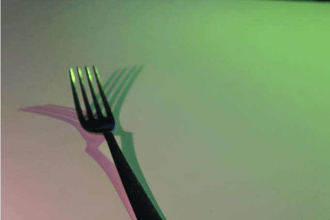
André Kertész
|
|
|
|
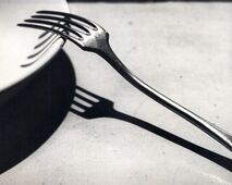
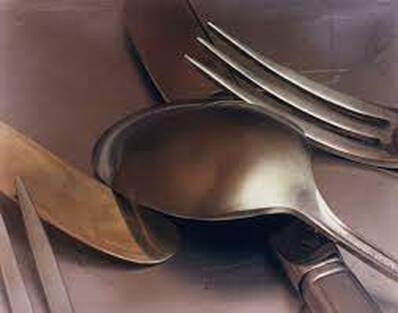
André Kertész is widely regarded as one of Europe’s leading photographic artists, particularly for his contribution to photographic composition and the photo-essay. He is credited with the 'La Fourchette': a perfect opportunity to meditate on strong composition and what makes it so. His work focusses on the idea of taking a mundane, everyday object and photographing it in a way that presents it in a far more intriguing way than usual.
Photoshoot One
|
|
WWW:
I managed to take simplistic yet compelling images using only few objects in black and white colour. I edited the pictures taken in a way to create a more dramatic atmosphere. The images are also well focussed and (when multiple forks are in frame) the objects interact in striking ways. EBI: I took pictures from more interesting angles, playing with and distorting the shadows to further intrigue the audience. Furthermore, they'd be improved if I'd focussed more on the background of the images - made sure the white sheet covered all corners, more carefully positioned the shadows etc. |
Gif
|
WWW:
The fork remains in a similar place throughout all the frames, allowing for attention to be drawn to the moving shadows behind it. The colours of the lights also contrast well, making the difference in the two shadows a lot more distinguishable. It is also pleasing that both shadows appear to be mimicking each other, reflecting one another on either side of the fork. EBI: The pictures were taken at more regular intervals (the lights move less in between shots) so that the transition is smoother, allowing for a more fluid motion. The gif could also be better if the fork was more in focus so the reflections of the light could be seen more clearly. |
|
Edits
|
|
WWW: The exaggerated contrast, paired with the careful placement and composition allows for the simplistic images to appear more compelling. EBI: I'd attempted to create variety in the atmosphere of the images, possibly using different colours and clarity to achieve this. |
Photoshoot Two
|
WWW:
The light was directed from a variety of angles to manipulate the shadows in new, unique ways. The way that the light isn't just directed from behind the camera allows for more dramatic results as the light often works as a spotlight, drawing our attention towards certain areas of the frame more than others. EBI: The white sheet behind the objects evenly covered the entire background so that there are no distractions from the focal point of the image. Some of the images could benefit from a higher aperture. |
|
Edits
|
|
WWW: I successfully developed on my previous idea of adjusting contrast and clarity to create a more dramatic effect. The appropriate sharpening creates a clean finish and allows attention to be brought the focal point of the image. EBI: Similarly to the previous response, experimenting with lightroom to evoke a different fell to the images could have been an interesting way to develop on the pictures. |
Overview
I enjoyed this section of the project as eliminating overcomplications within the pictures really assisted in improving my compositional skills and allowed me to refocus my attention to the aspects of photography that can be overwhelmed and overlooked by the excitement of crowding and colour. I liked how the outcomes mirrored the work of Andre Kertesz as they too emphasises the power of minimalism; how beauty can be found within the finer things in our environment.
Ordinary to Extraordinary
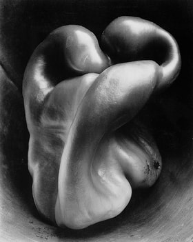
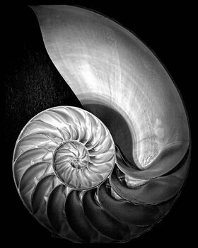
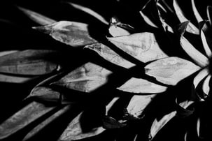
Edward Weston
|
|
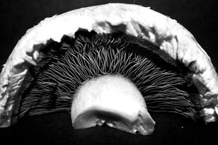
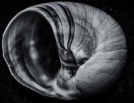
Edward Weston was born in Chicago and moved to California when he was 21. He knew he wanted to be a photographer from an early age, and initially his work was typical of the soft focus pictorialism that was popular at the time. Within a few years, however, he abandoned that style and went on to be one of the foremost champions of highly detailed photographic images.
Some of Edward Weston’s most famous work was close-up images of vegetables and fruit, photographed in a way that captured the “essence” of the object, taking them out of context. His manipulation of light to highlight shape, texture and form helped bring photography out of the shadow of painting and stand on it’s own as a credible art form. |
|
|
|
Photoshoot One - Natural Lighting
|
|
WWW:
I took the pictures from interesting angles to create more compelling images, I also used manual focus and a low aperture to draw attention to the primary subject of the photo. Editing some of the images to make them black and white allows the viewer to focus on the textures of the objects, much like Weston's work. The use of natural lighting in the photos means a generally even spread of the light across that side of the object causing simplistic, consistent reflections. EBI: I adjusted the brightness and contrast of the black and white images in photoshop to maintain an intriguing image. They could also be better if more than one type of vegetable/shell were used within the same image to demonstrate a contrast in texture between the objects. Furthermore, the ISO could've been adjusted to fit each individual picture. |
Edits
|
WWW: Like the Andre Kertesz response, the lack of colour allows focus to be brought to texture and placement. It, much like Edward Weston's photography, presents everyday objects in a new, fascinating light. EBI: The highlights on some of the pictures is too harsh which can distract from the texture of the objects. |
|
Photoshoot Two - Artificial Lighting
|
|
WWW:
The artificial lighting creates a very different effect on the object than the natural lighting. The ability to concentrate the light creates more of a contrast between the different areas of the image, composing a more striking overall photo. Also, using a higher shutter speed when working without a tripod - or any steady surface - ensures that the image remains sharp and detailed. Having a high shutter speed can also counteract the harsh lightning, making sure the image isn't too overexposed. EBI: The objects are more in focus and a higher aperture is used in some of the images as a higher depth of field would allow the texture of the entire object to be sharp. If I were to do it again I would also vary the camera angle more for some of the more diverse objects. |
Edits
|
WWW: I'd learned from the last response to keep a less drastic contrast so that the realistic texture was preserved, I instead used framing and a controlled angle of lighting to make the image more compelling. EBI: I'd focussed on one object and cropped it to limit the visual to only a smaller portion to really explore the diversity of extraordinary images that come out of a single object. |
|
Overview
Unlike the Andre Kertesz response, exploring photography in the style of Edward Weston in which the original objects are bright and colourful enables the viewer to completely adapt their viewpoint on seemingly mundane aspects of their environment. The contrast between the unedited and edited versions of the pictures really allows these differences in viewpoint to be demonstrated.
Lockdown Structures
Sharon Radisch
|
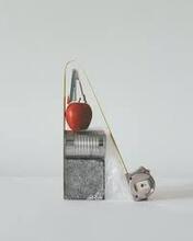
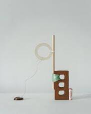
Sharon Radisch is known for her unique still life and fashion photography. With her specific use of colors, lighting, and styling, she creates work that is sculptural with elements of tension and connectivity. Sharon Radisch (being a still life photographer) began a series of images during lockdown containing random structures built using everyday household objects. She would use cheap, easily accessible materials - eg fruit, books etc - and stack them together to create essentially useless but attractive sculptures to photograph.
|
|
Response
|
|
WWW:
The sculptures accurately imitated those of Sharon Radisch's. The images are clear and (most) are framed well. The sculptures themselves are also very intriguing to look at, the combination of objects are parculiar, yet somehow work really well. I also experimented the with angles well to get multiple very different images from just one sculpture. The lighting is head on but not too bright so no attention is drawn away from the objects by bright light but they are still clearly visible. EBI: The background covered the entire frame in all of the images. They could also be more pleasing to look at if I'd experimented with objects of brighter, more interesting colours more as they are mostly composed using only objects that are black and brown. Some of the pictures called also benefit from a higher aperture as with these sculptures we would want tall the objects in frame to be focussed. |
Michael Craig-Martin
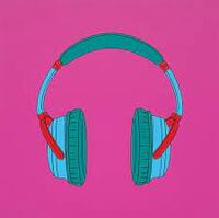
|
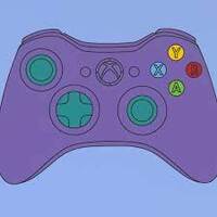
|
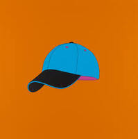
|
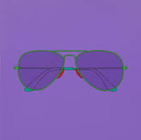
|
|
Michael Craig-Martin is an Irish artist and painter famous for his incredible impact ion the pop-art movement. He is well-known for his digital art made with simple, still-life photography edited to bright block colours. For this task, I used the photos previously taken inspired by Sharon Radisch's work and edited them in Michael Craig-Martin's pop-art style.
Response
.WWW:
The colours compliment each other well. Having two different block colours for each object makes it clear what each object is and adds an element of depth to the image. EBI: Some of the edges were cleaner and some of the shapes were more precise (less wobbly). |
|
Overview
This section inspired me to develop my idea of still-lifes of objects found in my domestic environment, however it moves from the finer details of one object to multiple objects and how they can be manipulated to interact in varieties of ways. Although, I continued the theme of a blank background behind the subject to eliminate distractions. Developing on the original photographs with Michael Craig-Martin's pop art style introduced the idea of using alternative mediums to demonstrate the environment in a less literal sense.
Kitchen Environment
Jan Groover
|

|

|
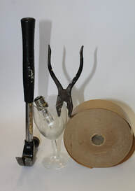
Jan Groover was an American photographer, well known for her formalist still life photographs of household utensils. She was born in 1943 but it wasn't until around the age of 30 (in the early 70s) that she turned to photography after years of being a painter. All of her photography was incredibly influential, however in this task we focussed on just her Kitchen Still-Lifes.
Photoshoot One
|
|
WWW:
The colour scheme of the objects all work well together. The lighting makes the glass look a lot more striking than it would otherwise and the camera is focused well to draw attention to the best part of the image. The use of leaves and petals adds the appropriate pop of colour the photos needed. EBI: They were less zoomed in as zooming in too much when using a phone can make the image very grainy. I'd used water (without soap) in more of the photos. I would also prefer if more bigger objects - things like plates and bowls - were featured. I'd utilised the set up better, framing pictures better and positioned the utensils more interestingly. I added more extra little objects other than the regular utensils. |
Edits
|
WWW: The slight changes to colour via the variation of tint and saturation works really well with the given colour scheme. Sharpening the images really emphasises the texture in the glass, making it that bit more striking and exaggerates the established character of the series. EBI: I'd managed to reduce some of the excess noise created by zooming in too much with a low resolution camera and clarifying the texture. |
|
Photoshoot Two
|
|
WWW: The selection of cutlery and crockery compliment each other very nicely, they are very haphazard patterns and colours making is pleasingly chaotic. The sprinkle of chia seeds, bottle caps, sliced fruit (and vegetables) and petals really adds to the playful nature of the pictures and works really well with the main subjects. There is also a great contrast in character between this and the first response, proving the power colour and composition have over an image's atmosphere. EBI: I should have focussed more on the actual utensils rather than the background objects. Some of the images don't live up to their potential due to poor framing. |
Edits
|
WWW: The editing really brings out the colours and - the colours being the most captivating part of the images - make them even more compelling. These colours add to the playful nature of the pictures. EBI: I'd leaned into the unrealistic, childlike (almost cartoonlike) personality of the series more, rather than settling somewhere between realism and fantasy. |
|
Overview
This section was a nice conclusion to my developing theme of the domesticated environment as it presented sections of real scenes, rather than still-lifes against a blank background. The creative set-up and editing let me explore the impact colour and shapes have on a picture and how minor alterations can shift the entire atmosphere and evoke a completely different reaction on it's audience.
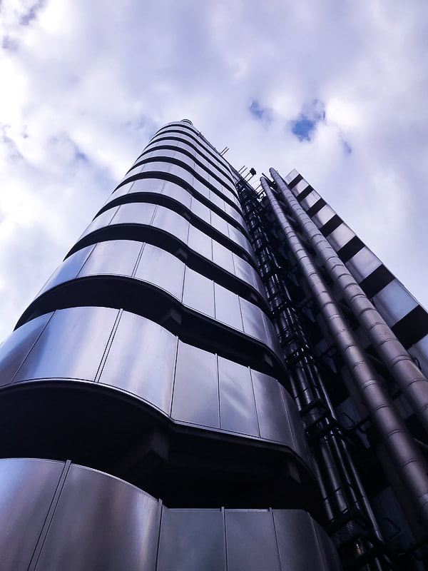
Looking Up
Photoshoot
|
|
Photoshoot
WWW: I managed to capture a variety of different images by varying the angle at which the picture was taken, the style of architecture photographed and the quantity of subjects in shot along with a few other elements. All pictures are well focussed with generally good lighting. EBI: I'd thought more about the composition of the images while taking them, how different parts of the images interact with one another, what direction the lines in the image lead the eye and so on. I also think that referring to inspiration throughout the process could have wildly improved the photos. |
Edits
|
WWW: The edited versions of the photos were edited to fit its individual style. These pictures are quite varied and are a nice twist on the work of Andy Yeung. I also like how the pictures speak to the environment theme as they accurately capture the atmosphere of London. EBI: Some of the pictures included many buildings - perhaps a whole street - as I think a more chaotic picture would have worked nicely with this perspective. |
|
Andy Yeung

|

|
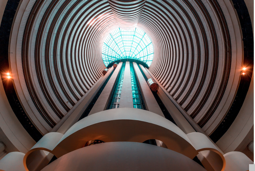
|

|
|
|
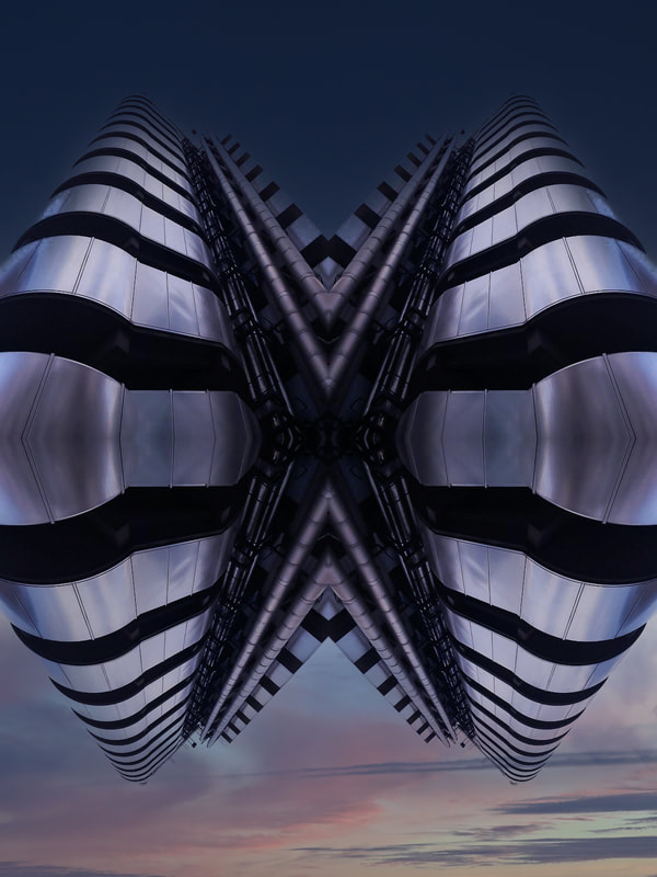
Andy Yeung is a Hong Kong based photographer who is keen on architecture and landscape photography. This task was inspired by Andy Yeung's 'Mirror City' work featuring images and timelapses of displaying a building from the perspective of someone at the bottom looking up. These pictures are incredibly captivating due to their symmetrical nature. In the first response to this, I used images taken of buildings in school and used photoshop to reflect the images both vertically and horizontally to achieve the same symmetry portrayed in Andy Yeung's work. The second response was the same thing but using the photos taken for the 'Looking Up' homework. |
First Response - School Images
|
In response to Andy Yeung's work, I used the pictures taken for the 'looking up' response to create static versions of his timelapse. I first reflected the image horizontally, then that whole image again vertically to create this symmetrical effect. For the first response, I used images taken on the school premises; for the second, I used my responses to the looking up homework. |

|

|

|

|
WWW: Both of the final results were evenly reflected both ways creating a very intriguing overall image. They accurately represent the work of Andy Yeung. EBI: I'd edited the colouring, brightness (etc) more notably in lightroom. It also would've been interesting to reflect the images in different ways to see how different an image it creates each time. |
Second Response - Homework Images
|
WWW:
I enjoy the intricacy of the pattern on the edit to the right as the building is composed of complex layers that create a compelling design when reflected. I believe the colour scheme compliments this design. EBI: I'd tried reflecting the image at different angles to experiment with the pattern it creates. |

|

|
|
|
WWW: I used the sky replacement tool in photoshop to change the background of the entire image to new one that covers the whole picture. Not only does this new background better fit the theme of the picture, but it also aids the illusion that the reflected buildings are all one floating entity. EBI: I'd edited the lighting in some areas and possibly cropped the original picture so that - when reflected - the bulge on the horizontal line of symmetry wouldn't be so prominent. |
Overview
I really enjoyed this section as I was able to focus on my external environment of London, a theme which I would later like to develop on. London is a very diverse and culturally significant city; the looking up idea not only aided me in capturing this diversity by focussing on individual structures, but also displayed this sense of importance as the upwards angle suggests superiority and high status. My take on the Andy Yeung-style editing allowed for isolation of the buildings outside of their usual environment, displaying an individuality that otherwise gets lost within the hubbub of Central London. T
Framing the Environment
John Divola

|
|

|

|
John Divola is a contemporary visual artist. He was born in America in 1949 and now, at the age of 73, he lives in California, still working as a photographer. He likes to describe his work as exploring the landscape by looking for the edge between the abstract and the specific. In the work shown above, Divola has used structures such as windows and doors to frame the landscape he is capturing, adding dimension to the image. I attempted to respond to this by, first taking a picture of a wider scene, then zooming into details of the image that other wise may have gone unnoticed.
Response
|
|
|
|
|
|
WWW:
The frame allows the viewers eye to be drawn to some of the more random parts of these images successfully. Allowing some of the scenery outside of the framed area to be seen clarifies exactly where in the first image our details can be seen. EBI: The pictures were more centred; an even amount of the frame (and that outside it) were displayed at each edge of the photo. |
|
Edits
|
WWW:
I cropped the picture with frame in it to make it more upright to better match the other image.` EBI: I chose a darker shade of blue to separate the pictures so it would better fit the one on the right. |

|
|
WWW:
I zoomed in on a significant part of the image, drawing attention to texture. EBI: There was no frame around the picture on the left as it would create a smoother transition between the pictures. |
Overview
I really liked the idea behind this task, however I feel my execution didn't do it justice. My response had it's own, unique take on the inspired artist (John Divola) which I think could have thrived in a different environment. Although this wasn't my favourite section, I appreciate that it broadened my horizons onto the natural environment too.
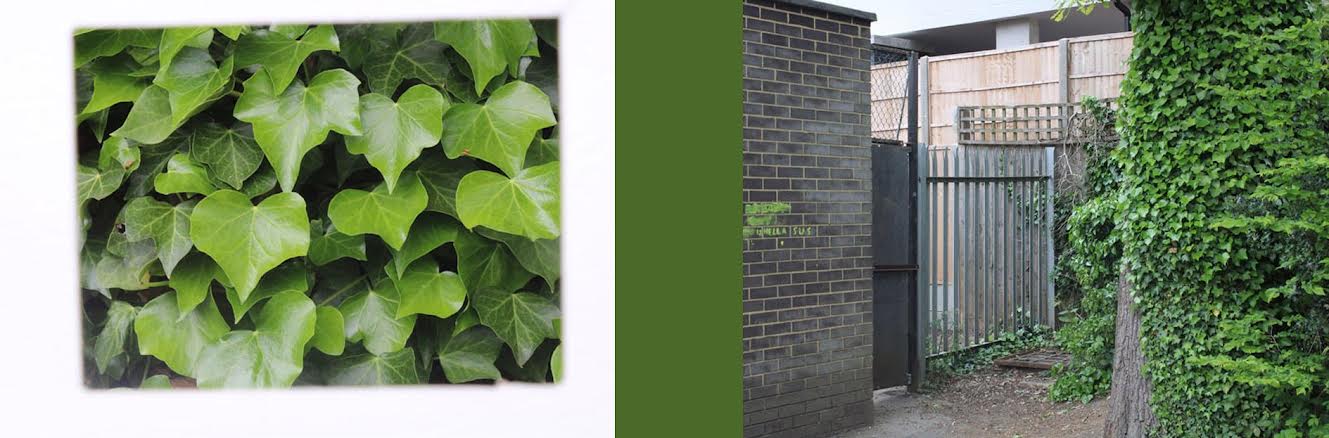
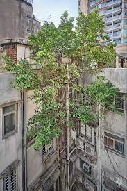
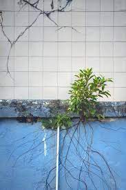
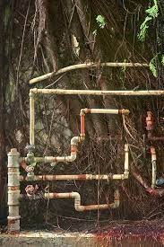
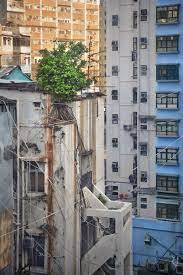
Wild Concrete
Romain Jacquet-Lagrèze
|
|
|
|
Romain Jacquet-Lagrèze is a French fine-art photographer based in Hong Kong. In 2014, Romain released a book entitled 'Wild Concrete', a collection of photos depicting the resilience of nature in even the busiest of cities in Hong Kong. Roots of plants growing through concrete and trees still thriving on human-inhabited blocks, etc. My response is inspired by this work, instead capturing the prevalence of nature in manmade structures around school.
First Response
|
|
WWW: Lots of the pictures are nicely composed, the rule of thirds heavily influencing the camera placement. There is also a nice contrast in colours between the bright, colourful leaves and the surrounding neutral tones. EBI: The pictures were focussed properly in all of the photos to draw attention to the finer details. The ISO of the pictures should have also been considered more. |
Second Response
|
WWW: The cooler looking tones of the image create a much different atmosphere to that of the last shoot. The location of the shoot allowed more interesting scenes to be captured. EBI: The angles the pictures were taken from considered what the background would look like. These could, again, be improved with attention to focus and also varying the aperture appropriately. |
|
Thrid Response
|
|
During this shoot, I took pictures relating to Wild Concrete in three different locations: a graveyard in Hampstead, areas within school and Parkland Walk in Crouch End. These three contrasting locations each brought a unique perspective to the shoot. The modernised, graffiti-ridden photos (taken at Parkland Walk) contrasts greatly with the more sinister representations of the overtaking of nature at the graveyard. |
Edits
|
WWW: These final edits demonstrate a wide variety of pictures based on the same concept. The minor editing helps to emphasise these variations and the individuality of each theme. EBI: I aimed for better quality pictures over a large quantity. I also believe that some of the images could have been framed better. |
|
Overview
Wild Concrete was a great way to link my previous ideas of the external, man-made environment to our natural one. The interactions between nature and man are so varied and it was incredible to explore the differing ways in which this relationship can be perceived. What I particularly enjoyed about this section was the ability to give nature character and present her in so many different ways. However, I believe there is more directions that can be taken through the exploration of architecture than nature in a city like London as it is our city's urbanisation that characterises it.
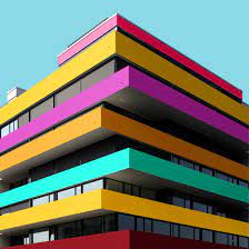
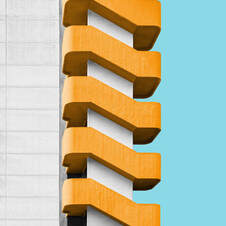
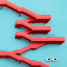
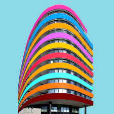
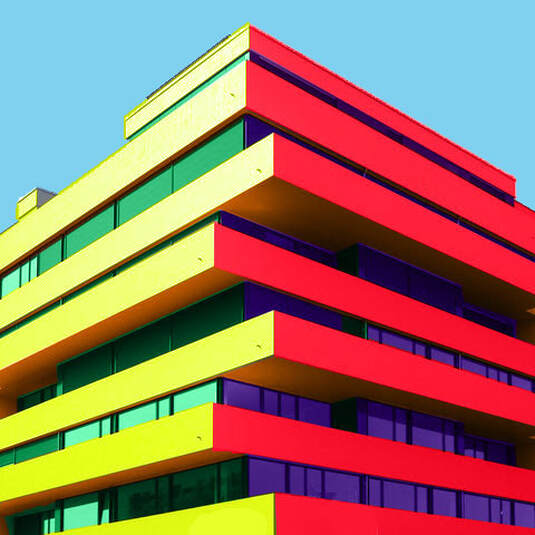
Colour Blocked Buildings
Paul Eis
|
|
|
|
Paul Eis is a German photographer born in 1998, however he later moved to Austria to study architecture at university. In 2205, Eis created an Instagram page to showcase his photography, mostly based on modern architecture; "I always had a fascination for towers, bridges and other spectacular buildings. Later, when I discovered photography, I got more into architecture and the built environment around me." However, he soon noticed how bland those monotonous buildings were and began to add colour to the buildings in photoshop to make each of them look unique and have a 'happier' appearance. This movement gained a lot of positive feedback from his community, causing Eis to further explore this style.
Paul Eis Response
|

WWW:
I successfully removed unwanted objects from the foreground, the lines separating each the colours are (generally) precise and the colours blend into the image well. EBI: The colour scheme was more thought out so that they work better together. It also could be improved if the section that was missed in the top left corner was filled. |
Simplified Building Response
WWW:
The lines that separate the sections of the building are sharp and precise. All texture is successfully eliminated. EBI: The whole image was simplified and if some details were kept in (eg the windows). |

|
Overview
While I found this section to be enlightening on the impact detail and colour have on how you perceive the character of a building, it made me realise that I would rather use a physical than digital medium to alter my images in order to present them more abstractly.
Mixed Perspectives
Thomas Kellner

|

|
Thomas Kellner is a German fine-art photographer, lecturer and curator. He became known above all for his large-format photographs of famous architectural monuments which, through many individual images and a shifted camera perspective, look like "photo mosaics".
Kellner achieved this by taking multiple pictures of the same building but altering the angle of the lens between shots. When these images were combined in series, it created the beautiful, distorted representations of the buildings as seen to the left. |
Response One
|
|
WWW: I combined the different photos taken in two different combinations to give two varying representations that look as the the building is 'moving' in a different way. EBI: The pictures were taken more zoomed so the transitions between the pictures would seem more fluid. |
|


Response Two
|
|
WWW: The angles of the pictures on both the left and right side of the building is shifted by approximately the same angle to make the pictures look more symmetrical. EBI: I'd chosen a larger, more basically structured building to allow the blanks to be interrpreted easier. |
|


Overview
I chose to explore the way perspectives of buildings can create a more abstract image, however I found this task to be slightly empty. I've concluded that it is interactions between multiple buildings that interests me the most as I feel there is more to be said about London by it's contrasting structures than what can be said about a singular building. This is why I plan to focus on collage as my final development of the Environment project.
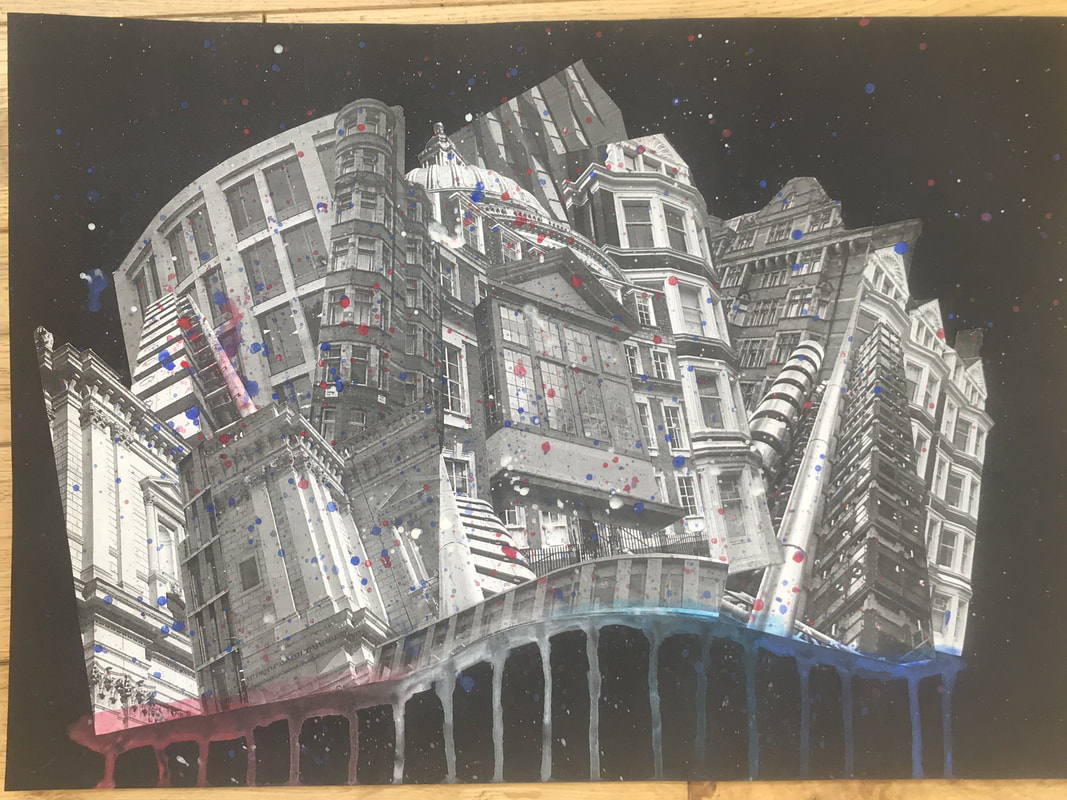
Development - Building Collages
Anastasia Savinova

|
Anastasia Savinova is a Russian multi-disciplinary aritist, her practice spanning photography, collage, drawing, text, video, sound, and performance. She has a background in architecture, this combined with her skills in photography and collage allows her to create these incredible pieces crafted from fragments of her environment.
|

|

|

|
Sun Ji

|

|
Sun Ji, much like Savinova, creates collages using his details from his environment. However, Sun Ji's collages are hyperrealist and usually feature industrial buildings, factories etc, to produce almost dystopian landscapes |

|

|
Development Plan
I plan to make three sperate collages of architecture in London to demonstrate aspects of London's society via it's physical appearance. I want to make these collages physically rather than digitally as I believe it frees the constrictions of only one medium.
Week One
|
|
Photoshoot 1 For this shoot, I went to both places Hampstead and lots of different locations in central London (Tottenham Court Road and the like) to obtain pictures of a wide variety of buildings: ranging from 17th century architecture to more modernised sops and office blocks. This shoot produced a good few pictures that can be used in my final piece for this development. However, I think that I shouldn't have used a compact camera to take them and instead just used a phone as some of the pictures are slightly blurry. |
|
Edits WWW: There is a wide variation in the style and atmosphere created by the pictures. They each contrast with one another nicely - despite being in the same area - which will work well to emphasise the diversity of the buildings in London when along side each other in a collage. EBI: Some of the pictures were taken from better angles. It would also work well with the development if some of the final edits were from pictures taken in different areas of London. |
|
|
|
Process
I printed off the best of the pictures taken, making sure there was a lots of variation between both the colours and style of the pictures. I then ripped each of the the pictures into smaller, random shapes. Once they'd all been split up, I played around with the arrangement of the pieces on an A3 sheet of black card. I soon learned that the picture was most impactful when the larger pieces were generally on the lower layers and the smaller ones closer to the top. Once I'd come up with a layout I liked, I began sticking the pieces down, starting from the bottom and working my way up until it was all stuck down. |
|
Final Piece One I really like this piece as the wide colour range and scrapbook feel create a playful yet compelling overall image. The contrasting colours and themes stacked on top of one another achieved the haphazard, intriguing design I was aiming for. I think a black backdrop rather than a coloured or white one was a good choice as it brings out the colours more and highlights tear lines in the paper. |
|
Week Two
|
|
Photoshoot 2
This shoot was also taken from lots of different location in London. While some of these locations include places like Camden and Hampstead, the main focus of the shoot was on locations closer to the centre of London. I tried to capture a diverse collection of images, each building a wildly different style to the last. Some of these include buildings of great historical significance, examples of this being St Paul's Cathedral and the oldest building in London. |
|
Edits For the main edits I used a range of different pictures to emphasise the diversity of London. These set of pictures, unlike the last, had to be somewhat well composed as I plan to cut out whole sections of buildings to use in the final piece. All of the buildings shown have completely different architectural styles which I think will create an overall more interesting collage. |
|
|
|
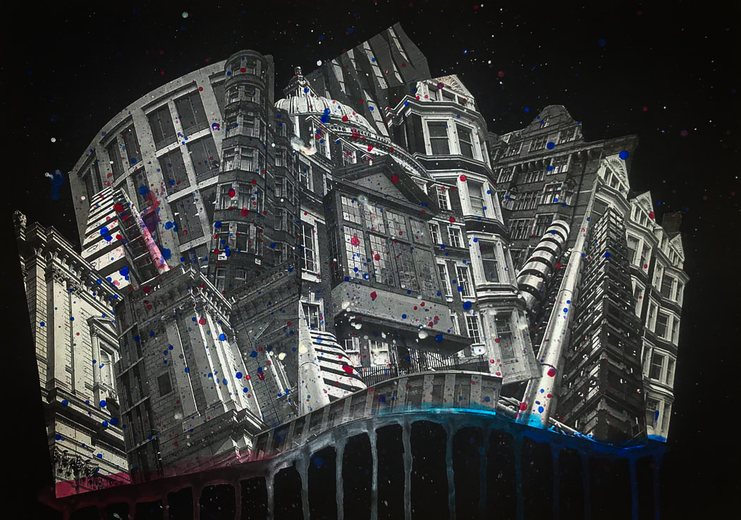
Process First, I printed out all of the black and white images and cut off the white border. Then I cut out either the entirety or just sections of the buildings in each picture. Then I played around with the different pieces until I found an arrangement I liked and stuck in all down. After this I thought it would look more appealing with a bit of added colour and so I splattered the collage with watercolour (so translucent) paints of the colours of the Great British flag as well and adding drips of the same colours in a line along the bottom of the buildings. |
|
Final Piece Two My aim for this piece was to create the appearance of one building made from many to contrast with the previous collage. However, the final product turned out more similar to the 'Layered Landscape' set task. I really like the overall shape the buildings create. The paints also adds the colour the picture needs; it makes it look almost celebratory as well as connecting the image to the backdrop nicely. |
|
Week Three
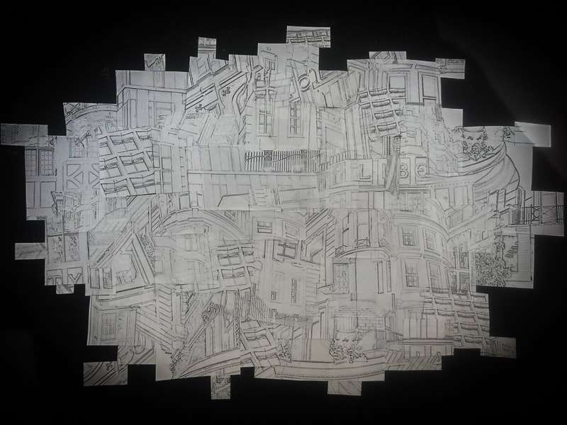
For the final collage I wanted to take the best of the pictures taken and repeated the collage a final time but, instead of editing the pictures to accentuate the colour or just making them black and white, I wanted to edit them so that they appear to be simple line drawings sketched with a pencil.
|
|
Method
On the left there is shown my method of editing the images to be used for my final collage into sketch-like pictures. I first accentuated the black points of image before making a copy of the layer. Next, I added an adjustments layer to turn down the saturation completely. I then took the layer second from the bottom and changed it to colour dodge. I then inverted this layer. Finally, I added a gaussian blur to achieve the final effect. Varying the radius of the blur, I could chose how prominent I wanted my line to be. I chose a relatively low radius as I didn't want them to just be simple black lines. |
|
Edits WWW: I achieved what I intended to. Although I didn't use the photos with the best composition, I chose the ones with the most interesting patterns within the image so that - when cut up - they would connect to make more intriguing designs. EBI: Each of the pictures had the same/a more similar thickness and prominence of the lines as the final result may appear slightly uneven due to this contrast. |
|
|
|
Process After printing out the edited pictures, I cut them into quadrilateral shapes which roughly resemble rectangles before shuffling the pile. Then I began to arrange the smaller pictures so that the lines of one would lead into those of the pictures next to it. Along the way I used masking tape to keep the pieces in the right position (in relation to each other). After I'd positioned the best of the pieces into an interesting arrangement with a nice shape, I stuck down the entire display onto the A3 sheet of card before removing slowly removing each bit of masking tape and making sure each individual piece was glued down. Then finally, I took a pencil a similar shade to that of the lines on the pictures and connecting any lines that weren't already feeding into eachother. |
|
Final Piece Three My initial idea for this piece was to have a closed off border around the edges and a more conventional shape, however as I was piecing it together I realised a more organic shape with the lines leading off the white sheet worked better with the random style of the collage. I really like the final product as your perspective on the image changes depending on how much attention you're paying to the finer details. |
|
Development Final Pieces

Collage One
This piece best represents the diversity of London using contrasting colours and themes layered closely on top of each other, mimicking the intertwined tapestry of London's culture. This is the only collage of the three that uses the image's natural colours which authentically establishes this variety. The scrapbook feel and bright colours of the collage make it very playful in appearance and quite abstract too. While this piece was originally inspired by Anastasia Savinova, the piece turned out more similar to the work of German artist Kurt Schwitters.
Collage Two
This collage takes lots of inspiration from Chinese photography Sun Ji as its random-looking layering of sections of buildings creates an abstract looking landscape. The pictures being black and white draws attention to the shapes and details within the images however can look slightly cynical. The splatters of paint in the colours of the Union Jack look quite celebratory - like confetti - making it appear quite patriotic alongside the drips of paint in the same colours which support the structure, reflecting the nationalistic pride on which our society is built; this piece's pessimistic take on London greatly contrasts with the almost naïve joyfulness of the first.
Collage Three
Unlike the others, there is no colour used in any part of the image, this is what gives it that resemblance of unfinished sketch. This took the longest time of the three as finding the correct placement where the lines feed into one another was particularly challenging. Alike the first piece, this collage holds more of a resemblance to Schwitters than it does Sun ji in that the layout is more random and free. However, most of the inspiration from this piece comes from, not an artist, but a poem: 'Tissue' by Imtiaz Dharker. It represents how the city is not built on mud and concrete, but in the relationships and contracts we form that feed into one another's lives - that paper is stronger than brick.
