I created this board as a brainstorm of the different ways I could approach the 'Change' theme to try and gain inspiration for how I can begin this project.
Plan
I chose the title 'Change' as it is an extremely versatile theme that describes a unique action that can occur to literally anything in any way. I will begin with by exploring three very different ways in which the title can be perceived: 'Change by Force', 'Change in People' and 'Change and Movement'. I will then evaluate which of these three ideas most strongly speaks to me and develop on this theme.
Strand One - Change by Force
Vilde Rolfsen

|
Vilde Rolfsen is a fine art photographer based in Oslo. Her series “Plastic Bag Landscapes” addresses the detrimental effects of plastic waste to our land and our oceans. While highlighting the abstract beauty of discarded bags found on Oslo’s streets by exposing them from a macroscopic perspective, Rolfsen also hopes her work will remind viewers to look more closely at their own consumption patterns. |

|
Photoshoot
|
|
During the shoot, I firstly photographed using a translucent white plastic bag, taking pictures from the inside using a natural, external light source. Then, to further develop I tried using artificial sources of light inside and outside of the bag to see how it would effect the colouring and contrast of the images.
I also experimented with different colours of plastic, however I soon found them to be less translucent, so were more restricting with light. Furthermore, these bags often had visible labels or variants of colour and opacity that somewhat ruined the illusion so I quickly switched back to the simple, white plastic. I also toyed with using water to add dimension to the scape. |
Final Edits


I utilised minor variation of colour tints, texture and contrast to make the image appear as though it is of a surrealist scape rather than an object so common as a plastic bag. It added depth and personality to the images and the emphasised creases of the bags allowed the weird texture to be interpreted in different ways. I think that the first of the three looks like a tunnel leading towards a mysterious light and I attempted to follow this idea by increasing the highlights so the light would be exaggerated; I added a golden tint to accentuate the theme of mystery. The second shape reminded me of something like a fern so I used a green tint to make it look slightly natural. The third is the most surrealist so I made it hazier with a softened texture and purple hue to make it look somewhat dreamy. The idea of change was interesting to me as it not only explored the change that applied forces can have on an object but also how you can change the viewers perspectives on an image with the focus on minor detail.
Line Drawing

|

|
The composition of the third picture greatly interested me so I decided to print it our and create a simple line drawing of it to allow attention to be drawn to the basic interactions of the image's lines. I used a simple hatching to demonstrate the shaded regions so that the concept of it's depth can still be grasped in this basic form.
Strand Two - Change in People
Francesca Woodman

|

|

|
Francesca Stern Woodman was an American photographer best known for her black and white pictures featuring either herself or other female models. She was born on the 3rd of April 1958 in US and died on the 19th January 1981 in the US. Francesca went to boulder high school and Rhode Island school of design. She died at the young age of 22. Many of her photographs show women, naked or clothed, blurred, merging with their surroundings, or whose faces are obscured.
Photoshoot
|
|
For this shoot, I used a black back background to ensure that the highlights caught as the light captures the movement is accentuated. I experimented with different types of movement and even played with creating the illusion of two different figures that are attached to offer a more surrealist approach, much like Francesca Woodman. I found that the uneven, natural lighting contributed an organic element to the movement expressed in the image. |
Final Edits


When editing these pictures, my main aim was to draw focus solely to the subject. Making the figure, and all the small details of her movement, vivid and obvious, while simultaneously creating a purely blank black background proved challenging as simply adjusting the contrast and exposure had detrimental impacts on the appearance of the subject. However, I overcame this by creating precise masks to allow me to accordingly adjust these, among other, settings. Overall, I am really happy with the final results as I believe they effectively convey spooky and emotional atmosphere inspired by Francesca Woodman while clearly illustrating both 'Change in People' and 'Change and Movement'. This will likely be the strand that I develop on when moving forward with the project as I not only think it is a very versatile theme that I would like to explore, but it also has numerous unique and interesting links to the change topic.
Strand Three - Change and Movement
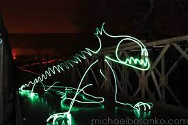
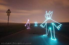
Michael Bosanko

|

|
|
|
Michael Bosanko is a photographer based in the South of Wales. While he creates a range of photography, he is most well-recognised by his 'Light-painting' work in which he uses an extremely long shutter-speed to capture moving light. In my response to this, rather than moving the light myself, I want to have a look at capturing the movement of cars and vehicles along roads to give an image that follows the path of their movement.
Photoshoot
|
|
In this shoot, I walked around my local area, capturing mildly busy roads at a long shutter speed. I made sure to go out later in the day as I needed the rest of the image (besides the lights) to be relatively dark to as not to be picked up so much when the shutter is open for a long time.
I found that finding flat surfaces to lay the camera on to assure it stays still was vital as even a slight shift of the camera would produce blurry images with shaking lights. I liked the effect given when a cars red and white lights would be exposed at points as it gave this interesting, intertwining effect. |
Final Edits


In the editing process I chose to play around with the idea of these stripes of light being the only colour in the otherwise black and white image. I achieved this by first creating masks over where the light was before duplicating and inverting this new layer. I then turned the layer of the rest of the scene into black and white, then experimented with changing the colour tints and hues of the light stripe. I ended up with some really interesting images, managing to achieve an effect of varying, contrasting colours in some of the pictures. I enjoyed taking pictures of my environment as it is and seeing what it came up with, it was fun to have this element of change out of my control. I also really enjoyed the editing process and the pieces it produced. Going forward I will definitely use this technique of masking areas to specify colour again.
Overview
I found experimenting with these three strands extremely useful as it not only helped my gain lots of different perspectives on how the 'Change' title can be perceived, but I also developed skills that will be helpful later on. The strand I plan to develop on is the second (Francesca Woodman response) as I enjoyed working with human figures and am curious to develop on creating threatening atmospheres.
Development One
Photoshoot
|
|
During this shoot I used a slower shutter speed to explore movement and duplication of the models.
I also toyed with simplistic light painting to block out features of the characters, as if they were hiding away. I tried to communicate a sense of frustration by manipulating facial expression and body position. All of these pictures are shot through a mirror to give a sense of distance and also practically so that the models could see how to move and where their eyes were in relation the the camera. |
Final Edits


Like Francesca Woodman, I utilised the absence of colour and lowered exposure to evoke a gloomy, creepy atmosphere. However, I decided make alterations to the highlights and light sources in the images to make it appear as though the only colour in the world is red. I achieved this in the way I'd learnt to when editing my third strand: by creating masks over the light sources and adjusting them appropriately to give the appearance that they are letting off a red glow. I also upped the contrast and tinted only the highlights red to aid this impression of solely red light. Once I was happy with the lighting, in order to enhance the spooky atmosphere I added grain to the pictures. I also slightly edited the texture, clarity and sharpness to make the separate figures easier to see. Overall I really enjoyed this first development and am extremely happy with the final result. However, I enjoyed the previous idea of movement of the entire body and would like to further explore this in an interesting location so I can have a look at movement and change within an environment.
Development Two
Deborah Turbeville - Wallflower

|

|

|
Deborah Turbeville was an American Fashion Editor, but became a photographer in the 1970s (when she was in her 40s). In 1978, she published a book titled 'Wallflower' in which she showcased a collection of her photography. Lots of these pictures feature figures stood eerily still in the woods. I liked the idea of the woods as a location to set the creepy atmosphere as it evokes an element of mystery and I think it would be a nice way to develop from the similar Francesca Woodman responses. For this development I would like to have a look at using a long shutter speed to capture the movement of figures through the woods.
Photoshoot
|
|
For this shoot, I got two models to wear their hair down with flowy clothing to allow for versatile, smooth and interesting movement. I made sure to take the pictures late in the evening so the long exposure wouldn't make the photos too bright. I also made use of the light in the environment and positioned the models under a street lamp to draw extra attention and allow their movement to be easily captured. This also adds drama to the pictures. |
Final Edits


I edited each of the three photos in a different style so I could see which theme I'd like to carry forward with the development. In the first, I attempted to emphasise the natural setting to make it more magical and mystical through the enhancement of the colour and making the background more visible. In the second, I tried to create a dreamlike, euphoric setting through softening the image and purple/pink tints. For the final picture, I converted it to black and white and - instead of colour - focussed on how I could edit other aspects of the image to evoke a spooky air. This third image was my favourite to edit and I believe is has the most potential for both versatile and powerful outcomes. Although I have decided to continue with the eery atmosphere of the third image, I am inclined to introduce some amount colour in future developments as I have discovered that just simple variation in colour can have a massive impact on the feeling of the final picture.
Development Three
Photoshoot
|
|
I decided to relocate this idea in a more modern, urbanised setting. This time I used just one model in light clothing (so would be better picked up by the camera when using a long shutter speed) and captured them moving through the underground station.
Within this I attempted to build a 'character' and show her movements. I tried to maintain this figure as the only subject in frame in order to provoke a sense of eerie solitude. I think the somewhat disheveled setting nicely compliments the gloomy atmosphere I am trying to create. |
Edits


In the edits, I kept the black and white theme I'd chosen from the last development in which I was testing out a variety of styles. However, I chose to incorporate the red tinted highlights as in the first development as it gives the illusion of a red light shining on a black and white world. One thing I could have improved is having a light shining on the subject as their figure wasn't picked up by the camera very well against the lighter background; I will work on balancing the brightness in future developments. I really like this idea of characterisation and creating a story through the movement of figures around a place. This is something I want to continue with in the next development where I'll take a closer look at setting.
The Gothic
Context
The Gothic is a movement whose origins trace back to the late 18th century. It lies within the genre of romantism and spans across many medium including literature, architecture and the arts. It often depicts frightening, pessimistic and mysterious views on the world and has historically been linked to the supernatural and the sublime. I believe the genre to demonstrate 'Change' in a multitude of ways. Some of which include: scenes of decaying structures showing change over time, a focus on the dead (or the undead) showing change in people and how a change in viewpoint can shift a viewer's perspective. This will also be a nice basis for me to continue developing on my theme of change and movement too.
Amanda Norman

|

|

|
Amanda Norman is a Liverpool-based photographer born in 1971 whose work is best described as gothic horror. Her work features gothic architecture and landscapes and frequently depicts unnatural and threatening images of people. The idea of a modern artists still being so captivated by centuries-old styles like these really demonstrates their timelessness. After looking at the work of Amanda Norman, I have decided to lean into the gothic theme for the rest of the project.
Development Four
Photoshoot
|
|
I used this development as an opportunity to focus purely on setting. During my research into the gothic genre, I noticed three primary recurring motifs: churches, trees/woodland and the moon/nighttime.
For this shoot, I went to many different churches and woods to experiment and figure out how to photograph these places in such a way that would fit the vision I am trying to achieve. During this, I mostly focussed on the effect that angles have (ie an upwards angle as in the second picture can appear more threatening), and the role light sources play in highlighting and creating shadows. |
Final Edits


Taking pictures based on my research was really helpful in my transfer to focus on the gothic as it has allowed me to draw my attention to aspects of photography that I never really focus on. In this development I looked solely at setting as it is a very important part of storytelling. Through editing these pictures, I found ways to pronounce important aspects of the image while simultaneously covering up blemishes or ares that seem out of place using alteration of texture and such on lightroom. I also found out which places would be accessible for full body photography.
Development Five
Photoshoot
|
|
I tried to take the concepts I'd gathered from earlier developments and consolidate them in this shoot. I made sure it was dark when I went out for three reasons: the long shutter speed would greatly lighten the image, it would fit better with the gothic theme and it would contrast better with the figure and so better pick up her movement.
The model wore flowy clothing once again and I experimented how she could be presented differently using movement. I also made sure to stick to the gothic theme by photographing in forests and around churches. |
Final Edits


I picked out many of my best pictures (18) so I could display lots of different effects using a slower shutter-speed and how they had been enhanced in lightroom. One of the ideas I tried to incorporate in this set was duplication: the model moved positions and stayed static in that place before moving again while shutter was open to create this effect as seen in pictures above. Another idea I used was continuous movement to create a blurred effect to distort her features and create an element of mystery. In some of the pictures I utilised a combination of these two ideas and played with how timing had an impact of the opacity of the moving parts.
When editing these, I decided to take the idea of tinting the highlights of a black and whit picture red to make it look as though a red light is shining on a black and white world; however I shifted the idea so that it was the shadows that had been tinted. This made the pictures look more sinister as the threat is coming from deeper within the image. I also altered features like the exposure and grain to add to the gloominess.
When editing these, I decided to take the idea of tinting the highlights of a black and whit picture red to make it look as though a red light is shining on a black and white world; however I shifted the idea so that it was the shadows that had been tinted. This made the pictures look more sinister as the threat is coming from deeper within the image. I also altered features like the exposure and grain to add to the gloominess.
Development Six
Photoshoot
|
|
This photoshoot was very similar to the last one in terms of location and goal. However, I used two models rather than one as I wanted to explore the different ways they could interact with one another. I also learnt from the last shoot dressing the models in lighter clothing would aid in their movement being picked up by the lens. The lighting is this shoot was very inconsistent, however I managed to overcome this in the editing process. |
Final Edits


I tried to edit these picture in the same style as the last set as I plan to use all of them in my final piece. I used the same idea of tinting the shadows, yet in some of the pictures I created a mask around the figure(s) in lightroom in order to enhance and lighten them without impacting the background. I turned the exposure down on all to the pictures as I plan to bleach them in the final development. I also think that adding the red hue was a good choice as I think colour will have an impact on how the bleach reacts. This shoot was a shorter one to I only picked out my best 7 ones in this shoot to edit, to bring the total to 25.
Final Development
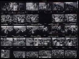
William Klein

|
|

|

|
William Klein was an American-born French photographer. While he was well-known for his filmography, he also had great interest in black and white photography. This included one idea in which he collected series of images that told a narrative on contact sheets. In some of these collections, he would use colour to accentuate particular pictures.
Outline
For my final development, I want to print out and bleach my pictures before editing them onto a contact sheet, in a storyboard-like style similar to William Klein.
Process
|
|
I began by duplicating my 25 edited pictures and getting those 50 photos professionally printed 4x6 inches. I couldn't print them out on normal paper as quality would be lost and the bleach would shrivel the page.
Once I had my pictures, I used 6 of my least favourite ones to experiment with how the bleach reacts with the pictures in different concentrations. I was unhappy with how dark the pictures were printed, however I found that - using a diluted bleach solution - I could dip my pictures into the solution and leave them to dry. This would not only brighten the images, but also leave a sepia effect and interesting textures on the surface. After one round of doing this to all of the pictures and leaving them to dry, I went back with a range of more concentrated bleach solutions and paint brushes to draw designs to mimic flames or light on the pictures. |
Bleached Pictures


I really like how these pictures turned out; I managed to create such variation between very similar (or even the two of the same) images. I also really like how the duration that the images were soaked in the (less concentrated) bleach had an impact on the tone of the pictures. Some of the pictures have really interesting blotches where the ink or bleach have gathered to create random and intricate designs, I feel that this randomness builds character and individuality to the images, as well as furthering the creepy atmosphere through disorder. The pictures are also very open to interpretation in that they bring forth different feelings and storylines in the viewers mind. I also think these pictures greatly fit the Gothic genre as - though they aren't quite in the style of Amanda Norman - they express that same part of romanticism that centres around the supernatural and unholy power. The addition of the bleach adds to this effect as is imitates fire which has satanic connotations. The white and innocent clothing in lots of these pieces contrasting with the creepy setting an editing gives a Carrie White-like effect of innocence vs destruction.
Editing Process
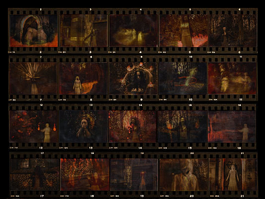
Unfortunately 4 of my pictures were taken portrait and so couldn't be included in my final piece as they wouldn't be uniform with the rest and they reflected light when scanned in. However, this means that I had 40 pictures which I decided to organise into two separate 5x4 contact sheets in a 'chronological' order, to reflect a storyline. I did this by firstly planning out an order for my pictures in two sets that showed a storyline, then I downloaded a contact sheet template off of google. I then imported this, along with each of my pictures, onto photoshop. I began the editing process by cropping out any white border pre-existing on the picture, before resizing and slightly reshaping them to fit into each of their designated rectangles. After I had completed this and tweaked it a little, I decided to import the results into lightroom so that I could make the pictures and template be consistent in colouring, texture and such. These final pictures could be improved if I'd been more precise with when cutting out the white borders around my images and used a higher quality template so the images wouldn't have to be so small.
Contact Sheets - Final Piece
|
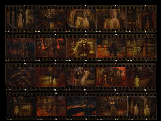
|
Conclusion
I am very happy with how these final pieces turned out. I managed to start with the basic concept of Francesca Woodman's long shutter speed pictures and adapt it in my own style through both the shoot itself and the editing process. From here, I looked again at using the full body and movement. Then I discovered Deborah Turbeville's pictures in the woods; these made me take a look at setting and sowed the seed of storyboarding. From here, I experimented with setting before my research into The Gothic led me to settle at creepy woods and churches. My exploration of editing styles and methods along with the effects of movement throughout greatly aided in the creation process of my final pieces. Finally, I saw how William Klein presents his pictures and was inspired to present mine in a similar way. Not only does this method of presentation go with the eerie atmosphere evoked, but also allows the viewer to interpret this set as a narrative.
These pieces greatly capture the Gothic genre and reflect the 'Change' title in three key way: change in movement, change in time and change of perspective and interpretation. One could also look deeper and notice the series as depiction of how power can cause Change.
These pieces greatly capture the Gothic genre and reflect the 'Change' title in three key way: change in movement, change in time and change of perspective and interpretation. One could also look deeper and notice the series as depiction of how power can cause Change.
